Buying Guide
Contemporary Abstract Art Prints: The Complete Buying Guide
11 April 2026
Contemporary abstract art prints are one of the fastest ways to give a room genuine identity. The right piece anchors an interior without competing with the architecture. It adds atmosphere, temperature, and a quality of attention that purely decorative choices don’t achieve.
The problem is that the category is enormous and the quality range is wider than almost any other type of wall art. Two prints can look similar in a product thumbnail and perform completely differently on the wall — in different light, at different distances, six months after they went up. Understanding what separates them before you buy is the difference between a piece that transforms a room and one that occupies it.
This guide covers everything: the style distinctions that actually matter for interior decisions, how to size correctly room by room, how light and wall colour interact with abstract work, how to layer multiple pieces without creating visual chaos, what the quality signals are, how to install and care for canvas prints, how Marta Ellie’s specific series maps to different spaces and needs, and realistic pricing across the full range. It also answers the questions buyers actually have — not the easy ones, but the ones that come up when someone is genuinely trying to make a good decision.
Part One: Style — What the Distinctions Actually Mean
“Abstract art” covers a wider range than most categories. Two paintings described as abstract can look and feel entirely different on a wall, suit completely different interior types, and create completely different moods. Understanding the main style distinctions helps you buy with specificity rather than hoping for the best.
Geometric abstraction
Geometric abstract work is built from shapes — grids, rectangles, circles, triangles — arranged with a deliberate structural logic. The mood is considered, architectural, precise. It has order without being literal about anything.
This style works best in interiors with clean lines and minimal clutter: contemporary apartments, modern villas with polished concrete and white walls, spaces where the architecture already provides warmth through material (stone, wood, linen) and the art’s job is to add structure and intention. A strong geometric abstract doesn’t warm a room — it focuses it.
Where it struggles: interiors that already have a lot of visual complexity. Heavily patterned textiles, ornate furniture, decorative objects — geometric abstraction competes with these rather than complementing them.
In Marta’s work: The Abstract Modern series includes pieces with geometric tension — structured compositions where the shapes have weight and the negative space is part of the composition. These suit contemporary villa interiors and clean architectural contexts where precision reads as a decision rather than coldness.
Gestural and expressionist abstraction
Gestural work is built from mark — the physical trace of a brush, a palette knife, a gesture across the canvas. It’s energetic, emotional, and has movement even when you’re looking at it from across a room. You can see the hand in it.
This is the style most associated with mid-century Abstract Expressionism — the New York School, Pollock, de Kooning, Kline — but contemporary gestural work is its own thing, informed by that history but not beholden to it.
In an interior, gestural abstract work does something specific: it brings energy into a room with clean architecture. A room with white walls, minimal furniture, and excellent materials can feel cold. The right gestural painting warms and activates it. The eye has something to travel across. The room starts to feel inhabited rather than staged.
Where it struggles: rooms that already have a lot of energy from pattern, colour, or furniture complexity. A gestural painting in a maximalist room is noise competing with noise.
In Marta’s work: The expressionist pieces in both the Abstract Modern and Coastal & Mediterranean series are the most directly gestural — loose mark-making, visible process, built from observation of landscape and light rather than formal structure. These suit modern spaces that need warmth, and they’re what most buyers are looking for when they say they want abstract art that feels alive rather than designed.
Organic and biomorphic abstraction
Organic abstraction works with curved, natural forms — shapes that suggest living things without depicting them. Leaves, cells, waves, bodies, root systems — none of these literally, but all of them implicitly. The mood is warm, natural, and generative.
This style sits between gestural and geometric: it has the softness and warmth of gestural work with more internal structure. It tends to suit interiors with natural materials — stone, unfinished wood, rattan, linen — where the organic quality of the forms continues the material language of the room.
It’s also the most universally approachable style of abstract work. The suggestion of natural form makes it legible to viewers who find pure geometry or pure gestural mark difficult to connect with. If someone says they like abstract art but they’re not sure about it, organic abstraction is usually the right introduction.
Colour field and painterly abstraction
Colour field painting is built from areas of colour — large, often subtle, with variation in tone and texture within the field rather than strong linear division. The interest is in how the paint sits on the surface, how light moves through it, how one area of colour breathes into another.
This is the style that rewards close looking and that performs best in low-distraction environments — a bedroom, a reading room, a study. From across a room it reads as atmosphere; close up it reveals complexity and surface.
It also tends to be the most technically demanding to produce well. A colour field painting that isn’t built with genuine layering and tonal range looks flat and empty. Done well, it has more depth than any other abstract style. Done badly, it’s an expensive painted wall.
In Marta’s work: The layered, painterly quality that runs through both her series — the result of twenty years studying how paintings are physically built — is most visible in the colour field pieces. The surface has depth because it’s literally built in layers: ground, underlayer, glaze, surface mark. Strong light doesn’t flatten it; it reveals more of it.
Part Two: Quality Signals — What Separates Serious Prints from Décor
The most useful reframe for buying abstract prints: stop asking “do I like it?” first and start asking “is this made to last?”
Edition control
An unlimited print is a product. A limited edition is an artwork in edition form. The distinction matters practically: a genuine limited edition — 20, 30, or 50 copies with a hard close when that number is reached — gives you something with real scarcity. When Marta’s editions close at 20, they close. The image isn’t reproduced again.
This matters for value over time, but it also matters as a quality signal. Artists who control their editions carefully are usually artists who care equally about the production standards of those editions.
Material weight and substrate
Archival canvas of 300 g/m² and above has physical density. It has texture. It behaves like art on a wall rather than a reproduction. Canvas at 150–200 g/m² — common in mass-market print production — looks thin, and that thinness reads at a distance even when you can’t articulate why.
Marta’s editions are produced on 365 g/m² museum-quality canvas. At that weight, the surface has genuine presence.
Print process and ink stability
Giclée printing with archival pigment inks is the correct process for fine art print production. Pigment inks have light stability rated at 100+ years under normal display conditions. The alternative — dye-based inks — may look brighter initially but fade unevenly over years, with some colour channels degrading faster than others. This produces the characteristic “yellowing” or colour shift of cheap prints exposed to daylight over time.
A print that fades on your wall within five years is a print that was never worth buying.
Artist provenance
Buying directly from the artist means the documentation is complete and unambiguous: the artist signed it, numbered it, and sold it to you. There is no chain to trace. This matters practically if you ever sell, insure, or loan the work, and it matters experientially in how you relate to the thing on your wall.
Part Three: Room-by-Room Sizing
The most reliable rule: artwork hung above furniture should fill 60–75% of the furniture’s width. Below that threshold, work reads as tentative regardless of its quality. This applies consistently across room types; what varies is the ceiling height, the wall width, and the role the artwork is being asked to play.
Main living room
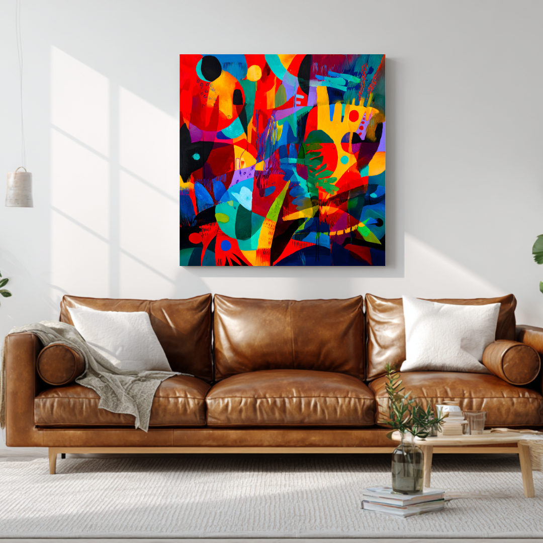
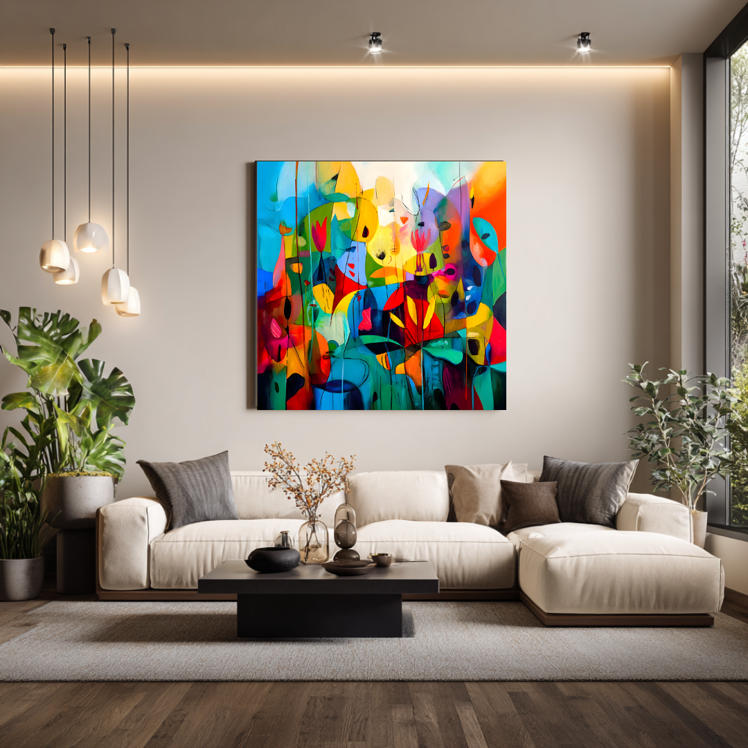
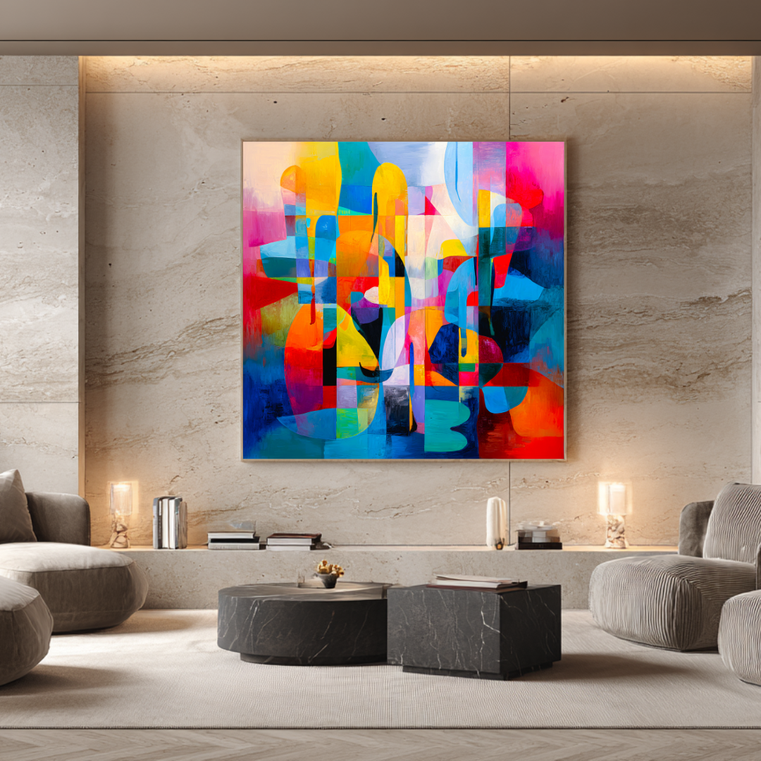
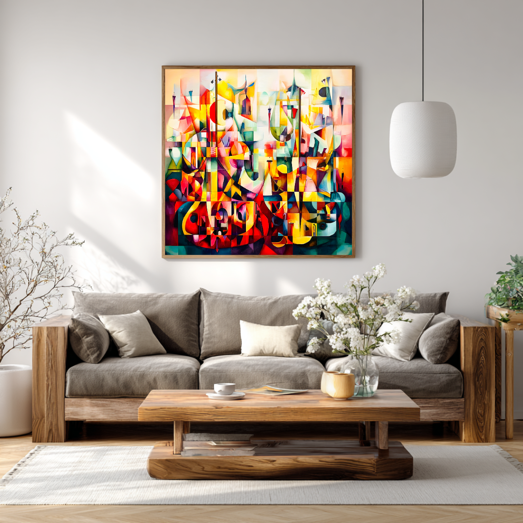
This is the room where scale matters most and where undersizing is most costly. A living room focal wall — typically above a sofa or behind the main seating arrangement — is the primary visual decision in the space. Getting it right anchors everything else.
Standard sofa (180–200 cm): One 120×120 cm canvas. This is the right format for most contemporary living rooms with standard ceiling heights (260–280 cm). It has genuine presence without overwhelming the room.
Long sofa or sectional (240 cm): Either a 150+ cm wide single canvas (available as a custom commission) or a deliberate pair of 120×120 cm prints hung with 8–10 cm between them, giving a total composition width of approximately 250 cm.
Large open-plan space (300+ cm wall, 300+ cm ceiling): Scale up to 180+ cm total artwork width. In these rooms, anything below 150 cm reads as a small gesture on a large surface. A pair of 120×120 cm works is the practical starting point; a commissioned original at a larger format is the bolder choice.
Hang the centre of the canvas at 145–150 cm from the floor. Leave 20–25 cm between the top of the sofa and the bottom of the canvas. Test with paper cut to size before committing to any holes.
Bedroom
The bedroom calls for a different register than the living room. The goal isn’t energy or presence in the same way — it’s atmosphere and something interesting to look at from the bed.
Above a standard double headboard (150–160 cm): A single 90–120 cm canvas hung centred above the bed. This is often where a colour field or more painterly abstract piece works better than a gestural one — something that creates mood rather than movement.
Above a king or super-king headboard (180–200 cm): A 120×120 cm single work, or two smaller related pieces hung as a pair. Leave approximately 15–20 cm above the headboard to the bottom of the canvas.
The bedroom is also a good candidate for a vertical format: a tall narrow piece on a bedside wall, or flanking a window. These can be smaller — 60–80 cm wide, 80–100 cm tall — because the purpose is to add interest and atmosphere rather than anchor a long wall.
Entrance hall
The entrance hall has one job: to make a first impression. It sets the register for the whole home.
Narrow entrance (wall width 100–150 cm): One strong piece at 80–100 cm wide, hung at eye level. The impact here comes from quality and colour rather than scale — there often isn’t the wall width for monumental works.
Wider entrance or double-height hall (wall width 150+ cm, or 4+ m ceiling height): This is one of the most powerful opportunities in any home for significant art. A double-height entrance can carry a large vertical format (150×200 cm or larger) or a tall diptych that engages with the full vertical scale of the space. A commissioned original at this scale is usually the right answer — the architecture demands something made for it.
Dining room
The dining room wall — usually the wall opposite the seating, or the end wall if the room is long — is experienced from a fixed distance (typically 2–3 m across a table). This changes what works: you see the piece at a consistent remove rather than walking past it or living with it at varying distances.
Standard dining room (wall 200–280 cm wide): A single canvas of 100–140 cm width, hung so its centre sits at approximately 145–150 cm from the floor. The dining room often suits a slightly warmer palette — the room is used primarily in evening artificial light, and warm-toned work holds better in those conditions.
Long dining room with narrow end wall: A tall vertical piece can be effective here — it emphasises the height of the wall and creates a focal point at the end of the table that draws the eye.
Study and home office
The study tolerates — and often benefits from — more intimate scale. This is a room for looking at something in depth rather than anchoring a large space.
A 60–90 cm piece hung directly in the sightline from the primary working position gives you something to rest the eye on during the day. The study is also where more challenging or complex abstract work can live without the room needing to accommodate people who find it difficult — it’s a personal space.
Corridor and stairwell
These transitional spaces are underused opportunities. The constraint in corridors is usually depth (you’re seeing work from very close) and wall width (often narrow between doors). Vertical formats work well in corridors — a series of tall narrow pieces at intervals, or a single strong vertical piece at the end of the corridor as a focal point.
Stairwells allow for larger scale, particularly tall stair walls that climb with the staircase. A large-format piece hung to be seen from multiple levels — positioned so it reads well from the bottom of the stair and from the landing — can be one of the most effective locations in a house for significant art.
Part Four: Light, Wall Colour, and How They Interact with Abstract Work
Natural light direction
South-facing rooms get direct sun through most of the day. Colours are washed by intense light at noon and warm dramatically in afternoon. Works with genuine tonal layering perform best — the light picks out different things at different times. Highly saturated flat colours can feel aggressive at noon.
North-facing rooms get consistent but indirect light — cooler, more even, and without dramatic variation across the day. Warmer palette work is particularly effective here: ochre, terracotta, warm sand, and layered warm whites hold their temperature in northern light. Cool-palette abstract work can feel cold in permanently indirect light.
East-facing rooms get strong morning light that fades by midday. Work that reads well in warm directional light performs well; work that depends on bright even light may look flat in the afternoon.
West-facing rooms get the best evening light — warm, low, and orange in summer. These rooms are naturally suited to warm palette abstract work, which intensifies beautifully in this light. They can also hold bolder, darker work than most rooms because the evening light provides enough warmth to balance it.
Wall colour
White and off-white walls are the most versatile background. Most abstract work reads clearly against white or off-white, which is why it’s the default in galleries. The risk is that a very warm-toned painting can feel slightly cool against a white that has blue or grey in it. Check whether your white is warm-based (cream, butter, linen) or cool-based (bright white, grey-white) before choosing a palette.
Warm coloured walls — terracotta, dusty rose, warm taupe, burnt orange — create an enveloping context. Abstract work that shares tonal references with the wall can disappear into it; work with strong contrast (a painting with dark grounds or cool accents against a warm wall) holds its presence. Deep indigo or charcoal abstract work can be spectacular against terracotta — the complementary tension between warm wall and cool painting creates electricity.
Cool coloured walls — slate grey, soft blue, sage green — suit abstract work with warmth in it. A painting with ochre, warm white, and soft sienna against a cool grey wall has exactly the contrast that makes both read more clearly. Like the warm wall scenario, work that matches the wall tone disappears; work that contrasts holds.
Dark walls — charcoal, deep navy, forest green — are increasingly common in contemporary interiors and they create a very specific context for art. Against a dark wall, pale and mid-tone abstract work glows. Light ochres, warm whites, mineral blues — these read as luminous rather than simply light. The dark wall does the same work as a frame, giving the painting a contained context that increases its visual intensity.
Artificial light
For rooms that are used primarily or significantly in artificial light — dining rooms, bedrooms, entrance halls in winter evenings — the quality of the artificial light matters.
Warm-spectrum bulbs (2700–3000K) suit most abstract work, particularly work with warm palette. They approximate evening daylight and create continuity with how the painting behaves in natural conditions.
Cool-spectrum lighting (4000K+) is common in kitchens and workspaces. Against cool light, warm palette abstract work can look desaturated and flat. If you’re planning a significant print for a space with cool lighting, consider adjusting the lighting before adjusting the art.
Dedicated picture lighting — a picture rail light or directional spot aimed specifically at the canvas — is worth considering for originals and museum-quality prints in primary spaces. It changes how the surface reads after dark and, in the case of layered painterly work, can reveal depth and texture that ambient lighting misses. Warm-spectrum LED picture lights are the current standard; they’re energy-efficient and don’t produce the heat of older halogen picture lights.
Part Five: Mixing and Layering Multiple Pieces
The first principle: one artist, one series
The most reliable way to mix multiple abstract pieces in an interior without creating visual chaos is to buy from a single artist’s body of work, ideally from related series. The works don’t need to match — they shouldn’t match — but they should share a visual language: a consistent palette range, a related approach to mark-making or composition, a coherent relationship to each other.
Two abstract prints from different artists, bought at different times from different sources, placed together on the same wall, usually look like two different decisions that ended up in the same place. Two prints from the same series, bought together, placed deliberately, look like one decision.
Room-to-room coherence
For buyers furnishing multiple rooms in the same home — particularly relevant for larger villas — a coherent approach across the whole interior is worth planning upfront. This doesn’t mean identical work in every room. It means a consistent visual thread: same artist or same body of work, palette that relates across rooms, a sense that someone made deliberate choices throughout rather than accumulating whatever seemed right at the time.
A practical approach: one original for the primary statement wall (the main living room, the entrance hall), and limited edition prints from the same artist’s series for the surrounding rooms. The original anchors the interior; the prints create the flow.
Pairing two pieces on one wall
When hanging two pieces as a deliberate pair — whether a formal diptych or two related works — the gap between them matters. Too close (less than 5 cm) and they look crammed together. Too far apart (more than 20 cm) and they read as two separate works competing rather than one composed arrangement.
For two 120×120 cm prints, a gap of 8–12 cm is the practical range. The exact spacing depends on the wall width and how much the composition needs to breathe. Stand at the distance from which the wall is normally experienced before fixing anything. What looks right close up often looks wrong from across a room.
Both pieces should be hung at exactly the same height — the centres aligned at the same point from the floor. A 5 mm discrepancy between two pieces at close range is visible and jarring. Use a spirit level.
Mixing scales
A large canvas paired with a smaller related piece — at different heights, not centred on the same wall — can create movement and interest that a single piece or a formal pair doesn’t. This works well in asymmetric architectural situations: a wall with a window or door that prevents a symmetrical arrangement, a stairwell wall that changes height, a room where the furniture arrangement is deliberately off-centre.
The smaller piece should be genuinely smaller — at least 40% smaller than the primary piece — to avoid a competition for attention. And the two pieces need a clear compositional relationship: same palette family, same series, or a deliberate complement (a warm-palette primary piece with a cool-accent secondary piece, for example).
Part Six: Hanging, Installation, and Care
Before the print arrives
Check the wall surface. Most contemporary walls are plasterboard (drywall) with a painted finish. A 120×120 cm canvas on a stretcher bar — which is the format of Marta’s limited edition prints — weighs approximately 3–5 kg with the stretcher bars. Standard picture hooks rated for this weight are adequate for most plasterboard walls. For walls with unusual construction (thick plaster, solid stone, or the rendered walls common in older Andalusian buildings), check the fixing method is appropriate for the surface.
Identify stud positions if you want to fix into a stud for added security. In standard UK and European plasterboard construction, studs are typically at 400 or 600 mm centres. A stud finder is worth the €20 it costs.
Hanging the piece
For a single canvas with hanging wire or D-rings on the back, two picture hooks — one on each side, at the same height — provide more stability than one central hook. A single central hook allows the canvas to rotate slightly over time; two hooks prevent this.
Mark both hook positions with pencil before hammering anything. Use a spirit level between the two marks before you commit. A spirit level check takes thirty seconds. A slightly tilted print that’s been on a wall for three months requires replastering when you rehang it correctly.
The centre of the canvas at 145–150 cm from the floor. Measure from the floor to the midpoint of the canvas back, mark the wall at that height, then calculate upward to where the hooks should go based on the position of the hanging hardware on the canvas.
Care and maintenance
Canvas prints — whether archival giclée or original paintings — do not need specialist cleaning in normal circumstances. Dust can be removed with a very soft, dry brush (a clean makeup brush or a photographer’s lens brush for corners and edges) or a soft lint-free cloth, very gently. No moisture. No cleaning products. No touching the printed or painted surface.
Keep canvas prints out of direct, prolonged sunlight. Archival pigment inks are rated for 100+ year stability under normal display conditions, which means indirect daylight and artificial light at typical domestic levels. Direct sun — a canvas in a south-facing room where direct sunlight falls on the surface for several hours a day — accelerates any material over a long enough period.
Avoid high-humidity environments. Bathrooms and kitchens with inadequate ventilation are not appropriate locations for canvas prints. The substrate and the inks are stable in normal domestic humidity ranges; extended exposure to steam or condensation can cause substrate distortion and edge lifting.
If a canvas print is ever dented — by an impact that creates a small inward depression in the canvas — this can sometimes be resolved by gently moistening the back of the canvas with a slightly damp cloth (not wet) and allowing it to dry slowly while face up. For anything more significant, contact the artist before attempting any intervention.
Framing
Large canvas prints on stretcher bars — particularly at 120×120 cm and above — are typically displayed unframed. The stretched canvas is a complete object; a frame on a large canvas can feel heavy and unnecessary, and it often reduces rather than increases the work’s contemporary quality.
Framing makes more sense for:
- Smaller prints (under 80 cm) where the canvas depth is minimal
- Works where the wall finish is traditional or classical and a frame provides an appropriate visual transition
- Works on fine art paper rather than canvas (though the editions discussed here are canvas-based)
If you frame, choose a simple flat frame — no ornate moulding — in a finish that complements rather than competes with the palette. A 3–4 cm wide flat frame in natural wood, black, or white typically works without introducing a new visual element.
Part Seven: Marta Ellie’s Series — Mapped to Interior Contexts
Understanding which series of work suits which context prevents the mismatch between a beautiful piece and a space it can’t serve.
Abstract Modern series
Character: Structured, layered, with geometric tension in some pieces and more painterly field work in others. Warm palette with deep accents. Tonal range from light surface marks to deep grounds.
Best contexts: Contemporary villa living rooms, entrance halls with clean architecture, studies and home offices where precision and structure suit the purpose of the room.
Light conditions: Performs well in strong light. The layered construction holds under Mediterranean noon sun without washing out. Also holds in north-facing rooms because the palette warmth compensates for indirect light.
Pairs well with: Natural stone floors, white or off-white walls, warm linen and wool textiles, clean furniture lines. The Abstract Modern series suits interiors where the architecture is doing the work and the art’s job is to add depth and warmth.
Coastal & Mediterranean series
Character: Looser, more gestural, built from direct observation of the Andalusian coast. Mineral blues, bleached neutrals, warm sand, ochre, the orange of late afternoon light on water.
Best contexts: Homes in direct proximity to the Mediterranean coast — Marbella, Estepona, Sotogrande, Málaga — where the painting and the place are in dialogue. Also works in any interior built around a coastal or Mediterranean palette, regardless of literal location.
Light conditions: Made in the same light it’s designed to hang in. Strong directional Mediterranean sun is what these pieces were painted under; they hold it rather than fighting it.
Pairs well with: Terracotta and whitewashed walls, sea-glass and rattan, bleached wood, the specific material palette of Andalusian villa interiors. This series is the most directly place-based in the collection — it belongs in homes connected to this particular coast.
Part Eight: What You’re Paying For — Pricing in Full
| Type | Price range | What it includes |
|---|---|---|
| Mass-produced décor print | €30–€100 | Unlimited edition, non-archival materials, no provenance |
| Mid-market open edition | €100–€250 | Better materials, variable edition control, limited documentation |
| Limited edition giclée print | €300–€500 | 20-copy edition, 365 g/m² archival canvas, signed, numbered, worldwide shipping |
| Small original commission | €3,000–€5,000 | Hand-painted, unique, any format, tailored brief |
| Large original commission | €5,000–€9,000+ | Monumental scale, architectural brief, specialist shipping |
At the €300–€500 limited edition tier, there is no gallery commission in the price. No marketplace fee. No intermediary markup. The price reflects archival production, twenty years of professional practice, and a work that will hold a serious interior and hold up over time. Everything below this tier is decoration. Everything above it — originals — brings different qualities that may or may not be necessary depending on the space.
Part Nine: Frequently Asked Questions
Are contemporary abstract prints a good investment? Limited, signed editions from working artists with verifiable track records hold more long-term value than unlimited décor prints. The scarcity is real — an edition of 20 is an edition of 20 — and works from artists with consistent collector demand tend to appreciate as the body of work develops. That said, buy primarily because you want to live with the work. Investment behaviour is a secondary benefit, not the reason to buy.
What’s the difference between a giclée print and a standard canvas print? Giclée uses archival pigment inks applied through a precision inkjet process calibrated to the colour profile of the original artwork. Standard canvas prints often use dye-based inks through a general-purpose digital print process. The difference shows over time: pigment inks are rated for 100+ year light stability; dye-based inks fade unevenly within years. The difference in surface quality is also visible immediately if you look at both close up.
Do abstract prints work in traditional or classical interiors? Yes, often very effectively. Contemporary abstract work frequently creates the most interesting tension in traditional or transitional spaces — the contrast between classic architectural detail (cornicing, skirting, panel moulding) and a loose gestural or colour field painting makes both read more clearly. The key is choosing abstract work with warmth: palette-based or gestural work in warm earth tones works better in traditional interiors than cold geometric abstraction.
How do I choose between the Abstract Modern and Coastal series? Interior context is the simplest guide. If your home is in or near the Costa del Sol and the interior draws on Mediterranean materials and palette, the Coastal & Mediterranean series was made for that context. If your interior is more urban-contemporary — clean lines, neutral palette, modern architecture — the Abstract Modern series usually fits more naturally. Both series share the same technical foundation; the difference is in palette and compositional approach.
Should I buy one large piece or several smaller ones? For a primary focal wall, one large piece almost always outperforms several smaller ones. A gallery arrangement in a main living room reads as accumulation rather than intention. For secondary rooms and transitional spaces, the calculus changes — a series of related smaller pieces in a corridor or up a stairwell can create movement and coherence. Let the purpose of the wall guide the format decision.
Can I request a specific colour palette or composition for a print edition? Limited edition prints are fixed productions — the palette and composition are set. Palette and format adjustments are possible through an original commission, where the work is developed in direct response to a brief that can include specific colour references, palette constraints, and mood direction.
What if a print arrives damaged? Contact Marta directly with photographs of the damage and the packaging, ideally within 48 hours of delivery. All prints ship fully insured, which means damage in transit is a resolvable situation — either a replacement from the edition (if copies remain) or a formal insurance claim for the purchase value.
How long does delivery take? From Marta’s studio in Málaga: 2–4 working days within Spain, 4–7 working days within the EU, 7–14 working days for the UK, US, and further international destinations. All shipments are tracked end-to-end and insured for the full purchase value.
Should I varnish a giclée print on canvas? For archival giclée prints on canvas, varnishing is generally not necessary and not recommended without consulting the artist. The production process is calibrated for the unvarnished surface. A varnish applied incorrectly can change the colour profile and surface sheen in ways that are difficult to reverse.
How do I know when an edition is about to sell out? The collection page at /prints shows current availability. Once an edition closes, the listing is updated and no further copies are available. There’s no waitlist mechanism — when an edition closes, it closes. If you’re considering a specific piece, buying sooner rather than later is the practical advice.
Do abstract prints need UV-protective glass if framed? For archival pigment inks on canvas, UV-protective glazing is not essential but adds an additional layer of protection if the piece will be in a room with significant direct sunlight exposure. For unframed canvas prints, the practical protection is placement — avoiding direct sustained sunlight — rather than glazing.
Can I see the work in person before buying? For buyers in Málaga or within driving distance, studio visits can be arranged by appointment. For international buyers, additional photography — detail shots, images in natural light, images in context — can be provided on request before purchase. Buying a significant piece sight-unseen is standard practice in the contemporary art market, but additional photography always makes the decision more grounded.
What to Do Next
If you’re ready to browse: the prints collection shows all current limited edition abstract works with physical dimensions, edition status, and pricing. Some editions are already sold through — when 20 copies close, they close.
If you have a specific space in mind and want to talk through scale, series, or whether an original commission fits better: the commissions page is the starting point. First conversation carries no obligation.
Other guides in this series that cover adjacent decisions:
- Abstract wall art: choosing pieces that transform a room — full guide to abstract art decisions and style
- Large canvas art for living rooms — sizing and placement in detail
- Landscape paintings for sale — for buyers considering landscape over pure abstraction
- How to buy original paintings online — the full process for original purchases
- Original paintings vs art prints — honest comparison for buyers deciding between the two
Prints ship worldwide from Málaga, fully insured. Commission enquiries answered within 48 hours.
From the collection
Prints related to this guide
Limited editions of 20 · Giclée on 365 g/m² canvas · Signed by Marta Ellie
View All Prints
Read next
Ready to find yours?
Museum-quality prints, from €300.
Limited editions of 20. Giclée on 365 g/m² canvas. Shipped worldwide from the studio in Málaga.
More articles