Buying Guide
Art Prints for Home Decor: How to Buy Better Than Mass-Market
11 April 2026
Most art prints sold for home decor have one thing in common: they were designed to sell, not to last.
A significant proportion of what appears on large online décor and print platforms was created digitally — often by a design studio rather than a working artist — optimised for thumbnail appeal, and produced at scale with no particular relationship to an original artwork, a specific place, or a specific person. It can look appealing on a phone screen. On a real wall, in a real room, the absence of depth and intention becomes visible — sometimes immediately, sometimes slowly over the first few months.
The result is the feeling most people recognise: a home that’s been decorated, not built. Art that fills walls without adding anything to them. Rooms that look like rooms rather than homes.
This guide is about doing it differently. Not necessarily spending more — though quality has a floor price below which it genuinely can’t be achieved — but buying with more understanding of what makes a print worth owning, how to plan art room by room, how to build a coherent collection over time, and where to buy work that will still feel right in five years.
Part One: Understanding Why Most Home Decor Prints Fail
To buy better, it helps to understand exactly why the mass-market alternative doesn’t work.
How mass-market art prints are made
Large online décor platforms — the ones with hundreds of thousands of listings and next-day delivery — typically operate one of two ways. Either they aggregate prints from designers and illustrators who upload digital files to be printed on demand (meaning no edition control, no production standard, and no relationship between what’s on the wall and an original artwork), or they license image libraries and print from those.
In both cases, the goal is volume. The image is created for maximum thumbnail appeal — bold colour, recognisable style, instant legibility at small sizes — because that’s what converts on a phone screen. What gets sacrificed is everything that makes a piece of art hold a room: tonal complexity, surface quality, the sense that someone looked at something and responded to it.
The production process reflects the same priorities. Mass-market prints are typically produced on lightweight commercial stock using dye-based inks through standard digital print processes. These materials are adequate for short-term visual impact. Over years — with exposure to daylight and the way real rooms get lived in — the colours fade unevenly, the substrate shows its weight, and the piece starts to look like what it always was: a print that was never intended to outlast a trend cycle.
Why the result feels generic
The generic quality of mass-market home decor art isn’t accidental. It’s the product of a deliberate design process aimed at broad appeal — work that is pleasant to most people rather than meaningful to any particular person. The absence of a real artistic point of view is the point. The work isn’t trying to say anything specific; it’s trying not to offend.
This is why two homes decorated with mass-market prints from the same platforms look like variations of each other even when the individual pieces are different. The prints share a design logic: appealing colour, approachable style, safe subject matter. The rooms end up with the same quality of anonymity regardless of which particular anonymous pieces are in them.
The alternative isn’t necessarily more expensive or more difficult to find. It does require knowing what to look for.
Part Two: What Makes a Print Worth Buying
The distinction between a print worth owning and a mass-market one comes down to a small number of factors. These aren’t subjective or aesthetic — they’re production decisions that determine how the piece behaves on a real wall over real time.
Relationship to an original artwork
The best prints are produced from an original artwork — a painting or drawing that exists in the world as a physical object, made by a person looking at something and responding to it. The print is a high-fidelity reproduction of that original, produced to preserve as much of its quality as the medium allows.
This is different from a digitally created image designed to look like a painting. The difference is visible in the same way the difference between a photograph of a place and a painting of that place is visible: the photograph can be technically perfect and still lack the quality of attention that makes a painting interesting to look at over time.
When you buy a print from a working artist, you know the original exists. You know someone made actual marks in response to an actual observation. That knowledge changes how you experience the piece on your wall — not as décor that was designed for your wall, but as a record of something that happened in a studio.
Edition control
An unlimited print is a product. A limited edition print is an artwork in edition form. The distinction matters practically: a genuine limited edition — 20 copies, 30 copies, 50 copies, with a hard close when that number is reached — means that when the edition is sold, no further copies are produced. The image doesn’t get reprinted for next season’s catalogue.
This scarcity is both a commercial and an artistic quality signal. Artists who control their editions carefully are usually artists who care equally about every other aspect of production. Edition control and material quality tend to travel together.
It also means something about the experience of ownership. Knowing you have one of 20 copies of a particular work is different from knowing you have one of an unlimited number. The piece on your wall is a specific thing, not an instance of an infinitely reproducible product.
Material quality
The substrate — the canvas or paper the image is printed on — determines the physical presence of the piece on the wall.
Canvas at 365 g/m² and above has body and density. It has texture. It behaves like art on a wall rather than a flat image on a flat surface. The difference is apparent from across the room even when you can’t see it up close: heavier stock has a quality of physical presence that lighter commercial stock doesn’t.
Fine art papers — cotton rag, 300+ g/m² — offer a different quality: the soft surface of the paper interacts with the image in a way that canvas doesn’t. Both are appropriate for different kinds of work; what matters is that the substrate was chosen deliberately for the work, not selected for cost.
Print process and ink stability
Giclée printing with archival pigment inks is the correct production standard for fine art prints. Pigment inks are rated for 100+ year light stability under normal domestic display conditions. Dye-based inks — the alternative used in most commercial print production — fade unevenly over years, with certain colour channels degrading faster than others. This produces the characteristic yellowing or colour shift of cheap prints after prolonged exposure to daylight.
A print that fades on your wall within five years was never worth buying regardless of what you paid for it.
Artist signature and documentation
A hand-signed, numbered print from the artist who made the original artwork is a documented object with clear provenance. It can be valued for insurance. It can be sold with clear title. It can be passed on with complete history attached.
An unsigned print from an unclear source has none of these properties. It’s décor, not a collected object.
Part Three: Room-by-Room Planning
The single most important principle in art planning for a home: fewer, better pieces over many average ones. A home with one well-chosen, properly scaled piece in each room feels more considered than a home where every wall is covered but nothing quite holds.
Living room
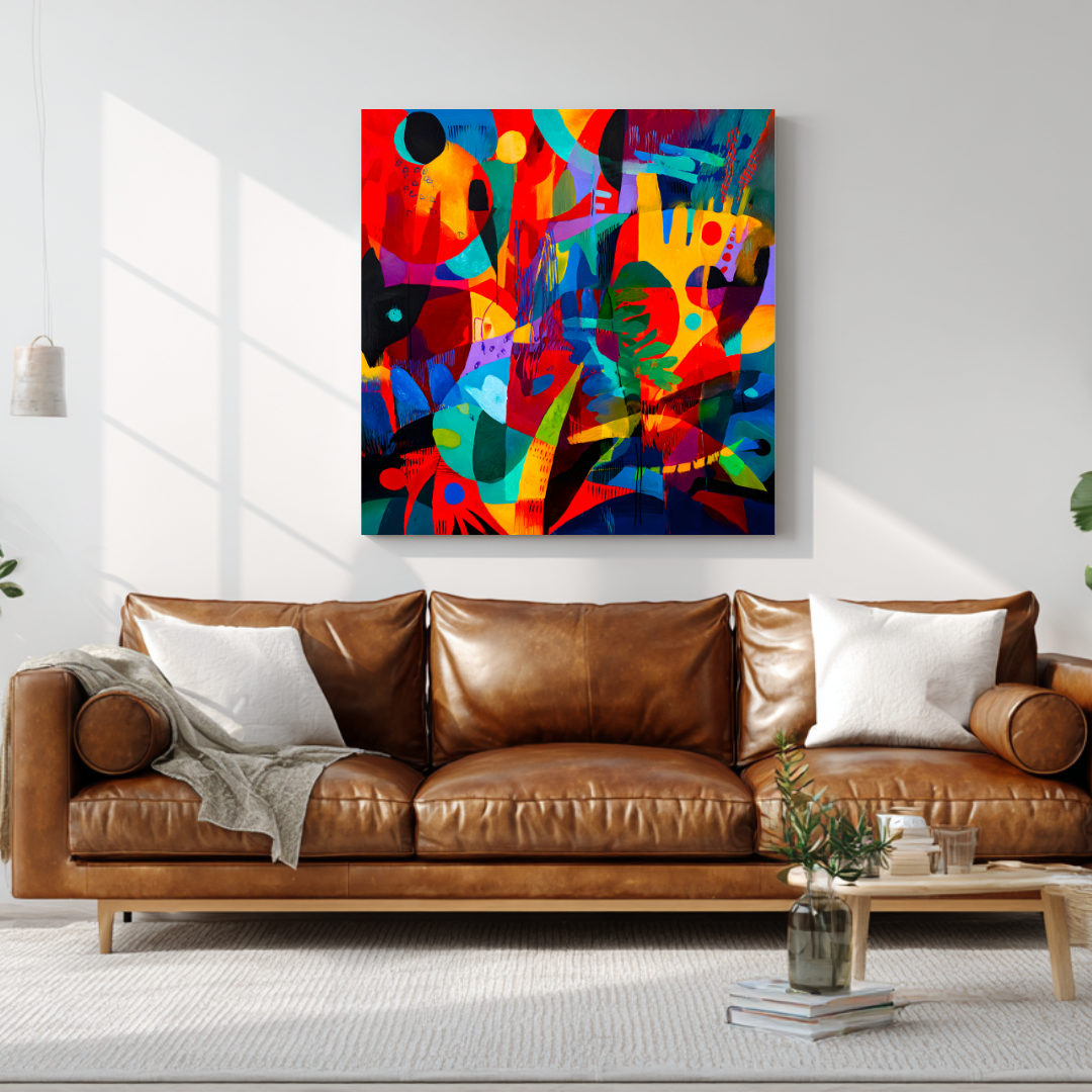
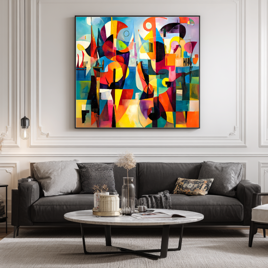
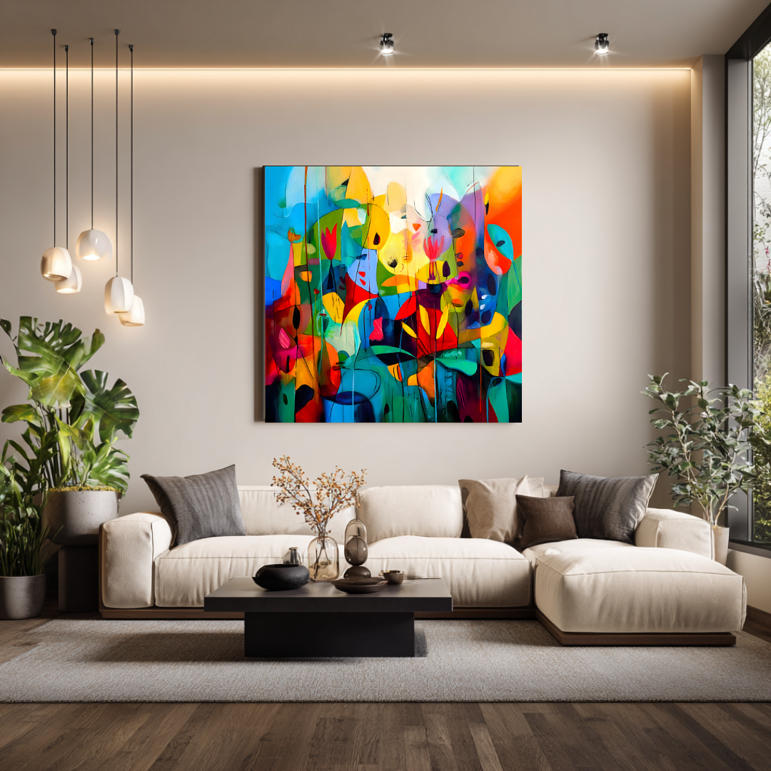
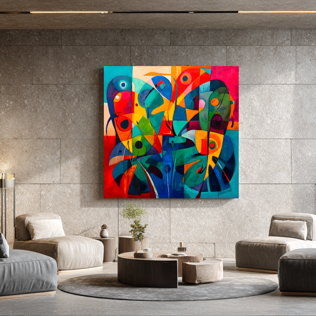
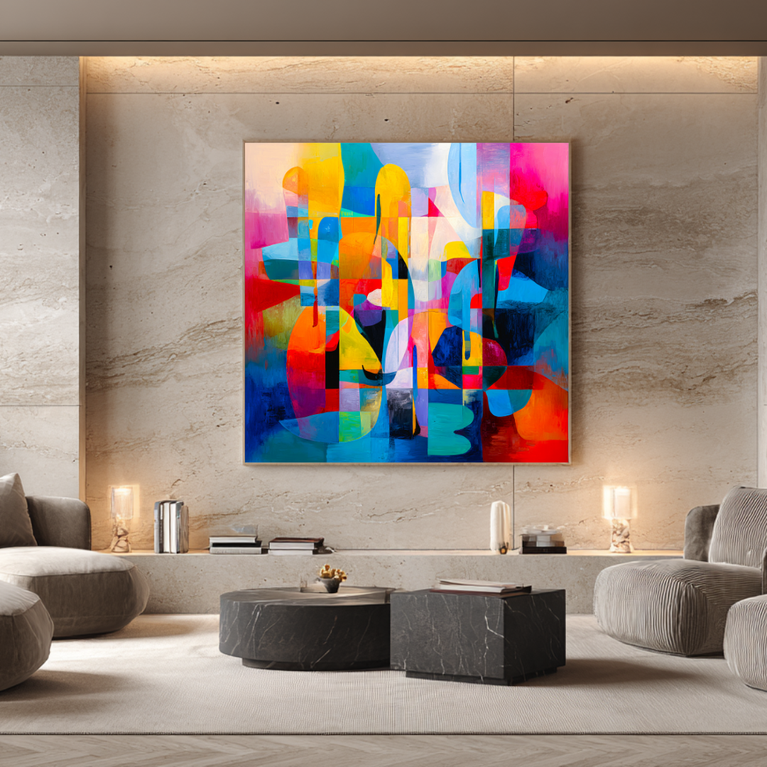
The living room is the primary statement space in most homes and the right starting point for any art planning. The main focal wall — typically above the sofa — is the most visually significant single surface in the home. Getting this right sets the tone for everything else.
Scale is the first decision. The artwork should fill 60–75% of the furniture width beneath it. For a standard 200 cm sofa, that means a minimum of 120 cm total artwork width. For larger sectionals, 150–180 cm. Anything below the 60% threshold reads as tentative and unconsidered, regardless of the quality of the piece.
For most contemporary living rooms, one strong canvas at the correct scale outperforms any arrangement of smaller pieces. A single 120×120 cm limited edition print on museum-quality canvas, properly hung, will transform a living room in a way that a cluster of smaller, cheaper pieces cannot.
Style in the living room: abstract work — gestural, atmospheric, or painterly — tends to suit the living room because it contributes atmosphere without adding narrative. A room used for different purposes at different times of day — morning coffee, evening entertaining, quiet reading — benefits from art that doesn’t assert a specific mood but creates a quality of attention. Abstract work does this; highly illustrative or subject-specific work often doesn’t.
Bedroom
The bedroom calls for a different register. Lower visual energy, softer palette, atmospheric rather than declarative.
The right question for bedroom art isn’t “what do I want to look at?” — it’s “what do I want to wake up to?” The answer is almost never something demanding. Coastal work, atmospheric abstract pieces with warm and restful palettes, painterly colour fields — these work because they create atmosphere rather than assertion.
Scale in the bedroom: above the bed, artwork should relate to the headboard width in the same proportional way as living room art relates to sofa width. For a standard double (150 cm headboard), 90–120 cm. For a king or super-king (180–200 cm), 120 cm single or a deliberate pair. Leave 15–20 cm between the top of the headboard and the bottom of the canvas.
The bedroom is also the right room for more intimate scale elsewhere — a smaller piece on a bedside wall or flanking a window. These don’t need to anchor the room; they need to add interest and atmosphere.
Dining room and entertaining spaces
The dining room presents a specific challenge: it’s a room experienced primarily in artificial light, in the evening, in social contexts. The art needs to hold under those conditions — warm light, conversation, people paying more attention to each other than to the walls.
What works: richer colour, more visual energy, work with rhythm and movement. The dining room can hold bolder palette choices and stronger compositions than the living room or bedroom because the room’s social energy supports it.
What to avoid: work that’s too quiet or atmospheric — it disappears in the evening light and the social context. The dining room is one situation where a more vibrant palette is an asset rather than a risk.
Sizing: the dining room focal wall — typically opposite the seating, or the end wall in a long room — benefits from a piece proportional to the wall rather than the furniture. A 120–140 cm canvas on a 250 cm dining room wall has presence and authority. A 60 cm piece on the same wall looks like an afterthought.
Hallways and connecting spaces
Hallways are transitional spaces — experienced briefly and in movement rather than from a settled position. This changes what works. Individual impact matters less than coherence: art that relates to the rooms it connects, that creates a sense of visual thread through the home rather than each room doing its own thing.
A series of related pieces — same artist, same palette family, sequential works — along a corridor or up a stairwell creates movement and narrative. Single pieces at intervals, with consistent spacing and consistent hanging height, can be more effective than any individual work in the series.
For stairwells specifically: the changing floor height means the conventional 145–150 cm hanging-centre rule doesn’t apply directly. A workable approach is to maintain a consistent relationship between the bottom of each artwork and the stair nosing at that point — this creates a diagonal line that follows the stair and gives the arrangement a sense of choreography.
Kitchen
The kitchen is often overlooked as an art space — it’s functional, it changes frequently, it has specific practical constraints (moisture, cooking vapour, cleaning). These are real limitations: expensive original paintings and delicate prints are genuinely not the right choice for a kitchen wall directly adjacent to a hob.
But the kitchen can hold art, in the right conditions. A properly sealed giclée print on canvas is more resistant to ambient moisture than work on paper. A position away from direct steam exposure — an end wall, a breakfast area, a kitchen-diner partition wall — is more appropriate than immediately above the cooking zone.
Style in the kitchen: this is where subject matter can be more literal than elsewhere in the home without feeling inappropriate. Botanical work, coastal references, still life-inflected abstract work — these suit the domestic and sensory quality of the kitchen in a way that pure geometric abstraction or heavy gestural work often doesn’t.
Home office and study
The study can hold more challenging and personal work than other rooms in the home — it’s a private space, often used alone, where the audience is you rather than guests. Work that you find genuinely interesting and visually complex is more appropriate here than anywhere else.
Scale: the study typically has less wall width than a living room, and the viewing distance from the primary working position is often shorter. This shifts the calculus slightly toward smaller, more intimate pieces. A 60–90 cm canvas hung in the direct sightline from the desk gives you something to look at in the way that musicians in restaurants once gave diners something to listen to — not the main event, but something that makes the environment better.
Part Four: Building a Collection Over Time
A considered art collection in a home isn’t assembled in one purchase. It’s built over time, with a sequence that reflects how the home develops and how the collector’s confidence and knowledge grows.
Start with the primary wall
Every home has one wall that does more work than any other — the living room focal wall, the entrance hall, the first thing you see when you walk in. This is where to start. One well-chosen, properly scaled piece on the primary wall sets the standard for everything that follows. It’s a reference point: other purchases are made in relation to it.
The temptation to spread a limited budget across multiple rooms simultaneously is understandable. The better approach is to concentrate on the most important wall first and build outward. One excellent piece in one room looks better than three adequate pieces across three rooms. And it’s cheaper to make subsequent good decisions when you have a reference point than when you’re starting fresh in every room.
Build coherence rather than matching
The worst outcome for a home art collection is what happens when each purchase is made in isolation — when every piece is chosen for its individual merits without reference to what’s already in the home. The result is visual incoherence: work that’s individually fine but collectively unfocused.
Coherence doesn’t mean matching. It means a consistent thread — same artist across multiple rooms, or a consistent palette range across different artists’ work, or a consistent tonal register (all warm, or all cool, or all high-contrast). The thread gives the home a sense of intention. It makes it clear that the collection was assembled rather than accumulated.
The simplest way to build coherence is to buy from one artist’s body of work across multiple rooms. The internal consistency of a single artist’s practice — the palette choices, the compositional approach, the quality of mark — creates coherence automatically. You don’t have to work at it.
Mix price points deliberately
A sophisticated art collection doesn’t require every piece to be at the same price level. What it requires is that the primary statement pieces — the ones that do the most work — are the strongest pieces. Secondary spaces can hold less expensive work without compromising the overall quality of the home, provided the less expensive work has genuine quality rather than just lower price.
A practical model: one original commission for the primary focal wall in the main living room; limited edition prints from the same artist for the bedroom, dining room, and study; and smaller or more personal pieces elsewhere. The hierarchy of investment matches the hierarchy of visual importance in the home.
Leave room for the collection to develop
A home furnished with art all at once tends to look finished in a way that doesn’t leave room for development. A home where the art collection is deliberately ongoing — where there’s always a wall that’s waiting for the right piece, where new purchases are made in relation to what’s already there — tends to feel more alive and more personal over time.
This is how serious collectors relate to their homes. Not as a project to complete, but as an ongoing process of refinement. The primary walls are strong from the start; the details develop over years.
Part Five: How to Mix Art Prints with Other Interior Objects
Wall art doesn’t exist in isolation. It exists in relation to the furniture beneath it, the objects around it, and the materials that make up the room. Understanding these relationships prevents the most common mistake in art placement: treating the print as a standalone decision.
Art and furniture
The relationship between a hanging piece and the furniture beneath it is the most important spatial relationship in the room. The 60–75% furniture-width rule exists because artwork that doesn’t relate proportionally to its furniture context looks like it was placed arbitrarily — even when the piece itself is excellent.
The surface material of the furniture matters too. A large gestural abstract above a linen sofa with natural wood legs reads very differently from the same painting above a dark leather sofa with metal legs. Both can work; neither is automatically right. The question is whether the relationship between the art and the furniture creates a composition that feels considered rather than coincidental.
Art and mirrors
Mirrors and art serve similar functions — they add visual presence to a wall — but they operate differently. A mirror reflects and multiplies the existing room; a painting adds something the room doesn’t already have. In most primary statement positions, a painting is the stronger choice: it contributes something rather than reflecting back what’s already there.
Mirrors work well as secondary elements — flanking a primary artwork, above a console in an entrance hall where depth and light are welcome. The risk with a mirror in a primary position is that it competes with the rest of the room rather than anchoring it.
Art and objects
The instinct to add decorative objects around a statement piece — candles, small sculptures, ceramics on the shelf below — is usually counterproductive. It distributes the visual attention that the artwork is trying to consolidate. A strong piece deserves clean space around it.
The exception is when objects are chosen with the same deliberateness as the art — when a ceramic on the shelf below a painting was chosen specifically for how it relates to the painting’s palette, and when both the painting and the object are contributing to a single composed view rather than competing for separate attention.
The test: remove the objects and see if the painting is stronger without them. If it is, the objects weren’t adding anything.
Part Six: Buying Art Prints as a Gift
Art prints are among the most meaningful gifts possible and among the most difficult to buy well for someone else. The difficulty is specific: unless you know the recipient’s interior in detail — wall dimensions, existing palette, what’s already hanging — you risk buying something with no obvious place to go.
What makes it work
The best art gift purchases happen when the buyer has one of three things:
Knowledge of the space. You’ve been in the home. You know the main living room wall, its approximate dimensions, what’s already there or conspicuously absent. You can make a reasonably confident scale and palette decision.
A conversation with the recipient. Not “what art do you want?” — that removes the gift quality — but enough understanding of their interior context that you can make a considered choice.
Flexibility built into the purchase. Some artists offer gift processes: a gift certificate or voucher that allows the recipient to make the specific piece selection, while the giver provides the value. This preserves the gesture while solving the fit problem.
What doesn’t work
Buying a print of a specific size and palette based solely on what you think the recipient would like — without any knowledge of their actual interior — is the most common gift art mistake. Even a genuinely beautiful piece becomes a problem if it’s the wrong size for any of their walls or the wrong palette for their existing interior.
For significant purchases — €300 and above — a conversation before buying, or a gift certificate approach, is worth the slight reduction in surprise. The alternative is giving something the recipient can’t actually use.
Buying for a new home
The best time to buy art as a gift for someone is when they’re moving into a new home or completing a significant renovation — when the interior is being established from scratch rather than already furnished. At this point, even approximate knowledge of the space is useful, and a significant print can be a genuinely foundational contribution to how the home develops.
Part Seven: Buying Direct vs Every Other Route
For most buyers who’ve done the research and know what they want, buying directly from a working artist is almost always the right decision. Here’s why that’s true even when it’s less immediately convenient than browsing a large marketplace.
What you get from direct
No intermediary margin. Every layer between the artist and the buyer adds cost. Gallery commission: 40–60%. Marketplace transaction fees: 15–30% of the purchase price, which is built into the listed price. Buying direct removes these layers. The price you pay reflects the work and the artist’s pricing, not the infrastructure around it.
Information that actually helps. When you buy from a marketplace, the person you interact with — if you interact with anyone at all — has limited information about the specific work. They can tell you the listed dimensions and the return policy. They cannot tell you how a specific piece behaves in afternoon light in a south-facing room, or whether a particular edition’s palette would suit terracotta walls, or what scale would work above a 220 cm sideboard.
The artist can tell you all of these things, because the artist made the work and knows it in detail. This information — available only through a direct purchase conversation — is often the difference between a good purchase and a disappointing one.
Clean provenance. A direct purchase from a working artist gives you the simplest possible provenance: you bought this from the person who made it. The certificate of authenticity, the signed and numbered print, the purchase invoice — all of these come directly from the source. There is no chain to verify, no previous owner to account for, no ambiguity about what you have.
The ability to ask before committing. Before placing an order direct from an artist, you can ask questions. Send a photograph of the wall. Ask which editions from the current collection would suit the space. Ask whether an edition is selling through quickly or has availability. None of this is possible through a mass-market platform, and all of it leads to better purchases.
When marketplaces are useful
Marketplaces are genuinely useful for one thing: discovery. If you don’t know which artist you want to buy from, browsing a curated art platform or marketplace is a reasonable way to find a style or body of work you hadn’t encountered.
Once you’ve found the artist, go direct.
Part Eight: Realistic Pricing — What You’re Actually Paying For
The price range for “art prints” online spans from €15 to €5,000. Understanding what drives price within that range prevents two mistakes: overpaying for work with inflated presentation and insufficient quality, and underpaying for work that was never designed to last.
| Type | Price range | What it includes |
|---|---|---|
| Mass-produced digital print | €15–€100 | Unlimited edition, commercial stock, dye inks, no provenance |
| Mid-market open edition | €100–€250 | Variable materials, sometimes archival, rarely limited |
| Limited edition giclée print | €300–€500 | Archival canvas, pigment inks, limited edition, signed, documented |
| Original painting (small) | €3,000–€5,000 | Hand-painted, singular, any size, direct provenance |
| Original commission (large) | €5,000–€9,000+ | Architectural scale, tailored brief, specialist shipping |
Marta Ellie’s limited edition prints sit in the €300–€500 tier: 365 g/m² archival canvas, 20-copy edition, hand-signed and numbered, shipped worldwide fully insured, with no gallery commission in the price.
For buyers planning art across a full home, a useful benchmark: one statement print at this tier will transform the primary room more effectively than three or four mass-market pieces across the same budget. Quality of placement outperforms quantity of coverage.
Part Nine: Practical Advice for Buying Better
Photograph your wall before you browse
Before looking at a single product page, take a photograph of the wall you’re planning to hang on. Full-width shot, in the room’s natural light if possible. Stick two pieces of masking tape on the wall at the dimensions of the artwork you’re considering (width and height) to give yourself a scale reference. Stand where you’d normally experience that wall and look at the tape. If it feels too small, it probably is.
This step — which takes five minutes — prevents the most common buying mistake: choosing a piece that looks right as a product image and wrong on the actual wall.
Ask for room-condition photographs
If you’re buying direct from an artist, ask for photographs of the work in natural daylight, and if possible in conditions that approximate your own interior (strong afternoon light, north-facing indirect light, whatever applies). Good artists can provide this. The difference between how a piece looks in a white-walled studio photograph and how it looks in real domestic conditions is often significant.
Buy the print before the frame
If you’re planning to frame a canvas print, order the print first and make the framing decision when you have the piece in hand. Framing decisions made from a product image alone tend to produce frames that don’t suit the actual work.
For most large canvas prints (120 cm and above), the instinct to frame should be questioned: the stretched canvas on the wall, unframed, is often the right presentation. Framing adds visual weight and complexity that the work sometimes doesn’t need.
Don’t buy in a hurry
The best art purchases are made from a position of confidence rather than urgency. If an edition is selling through — if there are only three of twenty copies remaining — that’s worth knowing and worth factoring into your timing. But a purchase made hastily because of perceived scarcity is still a purchase that has to live on your wall indefinitely. Take the time to be confident.
Frequently Asked Questions
Are art prints a good choice for luxury home decor? Yes, if the quality is right. Museum-grade giclée prints in genuine limited editions from working artists look completely at home in high-end interiors — particularly at larger formats where the material quality and surface presence of the canvas is visible. What doesn’t work in luxury interiors is the mass-market alternative: unlimited prints on lightweight commercial stock with no artistic provenance.
What’s the minimum quality threshold worth buying? Archival pigment inks, a substrate of 300 g/m² or above, and a genuine limited edition (not “limited” as a marketing term but actually capped at a specific number). Below this threshold, the print is décor rather than art, and décor at €300 is poor value compared to the same money spent on a quality limited edition.
How do I find art prints that don’t look generic? Buy from working artists with a clear, consistent, verifiable body of work — not from platforms that aggregate thousands of designers’ digital files. A working artist has a distinctive visual language that comes from sustained practice. Design-studio prints created for marketplaces have broad appeal by design; they’re not trying to be distinctive.
Should art prints in the same home match exactly? No. Exact matching creates a showroom quality — everything coordinated, nothing personal. Cohesion is what you’re looking for: a consistent thread of palette, artist, or tonal register that makes the home feel considered as a whole. The pieces should look like they know each other, not like they were ordered from the same catalogue.
How do I hang a large canvas print safely? Two picture hooks rather than one central hook — one on each side of the canvas at the same height. This prevents the canvas from rotating over time. Use a spirit level between the two hook positions before fixing. For walls above 5 kg canvas weight (standard for 120×120 cm canvas), check that the hooks are rated for the load. For solid stone or old plaster walls (common in Andalusian buildings), specialist wall fixings may be required.
What’s the difference between open edition and limited edition prints? An open edition print can be reprinted indefinitely — the image can be produced in unlimited quantities at any time. A limited edition has a fixed maximum number of copies; when that number is sold, production stops permanently. Limited editions have genuine scarcity, clear edition documentation, and tend to be produced to higher material standards than open editions.
Do art prints hold their value? Limited editions from artists with consistent collector demand tend to hold and sometimes increase in value, particularly as earlier editions sell through and the artist’s reputation develops. Open edition and mass-produced prints have essentially no secondary market value. Buy primarily because you want to live with the work; treat value retention as a possible secondary benefit rather than the primary reason.
Can I return a print if it doesn’t work in my space? This varies by seller. For direct purchases from working artists, the practical answer is: ask before you buy. Most artists selling direct are willing to have a detailed conversation about your space before purchase precisely to prevent returns — because a return means the piece didn’t find the right home, which no serious artist wants.
How should I plan art purchases across a whole home? Start with the most important wall — the living room focal point, the entrance hall, whichever wall does the most work in the home. Get that right first. Then build outward into secondary rooms, maintaining a coherent thread (same artist, consistent palette, related series). Leave room for the collection to develop over time rather than trying to furnish everything at once.
Is it worth buying art prints online without seeing them in person? Yes, provided you do the groundwork: check physical dimensions carefully against your wall, ask for additional photography in natural light and in real interior conditions, and buy from sources where you can ask questions before committing. The risk of buying art online is real but manageable. The risk of never buying anything because you can only consider work you’ve seen in person is a much more expensive constraint in the long run.
What to Do Next
If you’re ready to browse: the prints collection shows all currently available limited edition works with physical dimensions, edition status, and pricing. Some editions are already partially or fully sold through — the 20-copy limit is real, and works close permanently when they reach it.
If you have a specific space in mind and want guidance before buying: get in touch via the commissions page or directly. Share a photograph of the wall, the dimensions, and any constraints on palette or scale. Marta responds within 48 hours with a specific view on what from the collection would work — and whether a commission would be a better fit than an existing edition.
If you’re still building your understanding, the other guides in this series cover the specific decisions in more depth:
- Abstract wall art: choosing pieces that transform a room — style, sizing, and how abstract art works in interiors
- Large canvas art for living rooms — detailed sizing and placement for the primary space
- Contemporary abstract art prints: the complete guide — style breakdowns, lighting, layering multiple pieces
- How to buy original paintings online — the full process for original purchases
- Landscape paintings for sale — for buyers considering landscape work specifically
Prints ship worldwide from Málaga, fully insured. Enquiries answered within 48 hours.
From the collection
Prints related to this guide
Limited editions of 20 · Giclée on 365 g/m² canvas · Signed by Marta Ellie
Abstract & Modern
Metamorphosis
€325
Abstract & Modern
Dreams
€300
Coastal & Mediterranean
Harbor of Dreams
€350
Read next
Ready to find yours?
Museum-quality prints, from €300.
Limited editions of 20. Giclée on 365 g/m² canvas. Shipped worldwide from the studio in Málaga.
More articles