Buying Guide
Large Canvas Art for Living Rooms: Sizing, Placement, and What Actually Works
11 April 2026
The single most common mistake people make when buying art for a living room isn’t choosing the wrong style. It’s choosing the wrong size.
The piece they fell in love with online — rich colour, strong composition, something with genuine presence — arrives and sits a third of the way up the wall. Not because the work is wrong. Because the scale is. And from that point on, no amount of rearranging the furniture underneath it will fix the problem.
Large canvas art does more for a living room’s sense of presence and finish than almost any other single decision. But only when the proportions are right. Get the scale right and the room feels settled, considered, complete. Get it wrong and the piece looks like it was placed there temporarily and never moved.
This guide covers everything you need to make the right call: how to measure before you browse, what scale actually means in different living room types, when one large piece is the answer and when a diptych makes more sense, what large canvas art costs at different quality levels, and the placement mistakes that are easy to avoid once someone points them out.
Part One: Measure First. Browse Second.
Most buyers do this backwards. They find a piece they love, fall for it, buy it, and then try to make it work in the room. Sometimes it does. More often the scale is slightly off — too narrow, too small for the wall — and it’s only when it’s hanging that the problem becomes obvious.
The fix is simple: measure three things before you look at a single image.
1. Wall width — the total width of the wall you’re hanging on, in centimetres.
2. Furniture width — the width of whatever sits beneath the hanging space. Usually a sofa. Sometimes a sideboard, console table, or media unit.
3. Ceiling height — this tells you how much vertical space you’re actually working with, and whether the room can handle a tall vertical format or whether a horizontal or square composition works better.
With those three numbers, you can do the only calculation that matters before browsing.
The 60–75% rule
Artwork hung above furniture should fill roughly 60–75% of the furniture’s width. For a 240 cm sofa, that’s a target artwork width of approximately 145–180 cm. For a 200 cm sofa, roughly 120–150 cm.
This can be a single piece or two related canvases hung together. What it cannot be — if you want the room to feel considered rather than incomplete — is significantly below 60%.
Small art on a large wall doesn’t read as restrained or minimal. It reads as unfinished. Proportional art at the right scale reads as deliberate.
| Furniture width | Target artwork width | Notes |
|---|---|---|
| 160 cm sofa | 95–120 cm | One medium piece |
| 200 cm sofa | 120–150 cm | One strong piece or pair |
| 240 cm sofa | 145–180 cm | One large piece or deliberate diptych |
| 300 cm sectional | 180–225 cm | Diptych or monumental single work |
| Villa open-plan wall | 200 cm+ | Scale to architecture, not furniture |
Height: where the centre of the canvas should sit
The standard guidance — and it’s reliable — is that the centre of an artwork should sit at approximately 145–150 cm from the floor. That’s roughly eye level for a standing adult. It’s lower than most people’s instinct suggests, which is why so much art hangs too high.
Above a sofa or sideboard, allow 20–25 cm between the top of the furniture and the bottom edge of the canvas. Any less and the piece looks like it’s resting on the furniture rather than belonging to the wall. Any more and it floats away from its anchor point and loses the relationship with the room.
For double-height spaces — entrance halls, open stairwells, the generous living volumes in many modern Costa del Sol villas — these rules loosen. The architecture changes what’s possible and what’s required. More on that below.
Ceiling height and format choice
Low ceilings (240–260 cm) tend to suit horizontal formats or squares. A tall vertical canvas in a low room makes the ceiling feel even lower — it creates a compressed quality that the room doesn’t need.
Standard contemporary ceilings (270–300 cm) work well with squares and moderate verticals. The proportions aren’t fighting each other.
High ceilings (300 cm+) can carry ambitious vertical formats without compression. In these rooms, a tall piece can make the ceiling feel intentional rather than excessive. And in double-height spaces, a vertical diptych or a monumental single work that engages with the full wall height is often exactly what the architecture calls for.
Part Two: What Scale Actually Looks Like in Different Living Rooms
The numbers above are principles. Here’s what they mean in the actual room types where buyers tend to be making this decision.
Standard apartment living room (30–50 m², 260–270 cm ceilings)
The typical constraint here is wall width. Many apartment living rooms have a main wall of 300–350 cm, occupied partly by doors, windows, or storage. The usable hanging space above a sofa is often 220–260 cm wide.
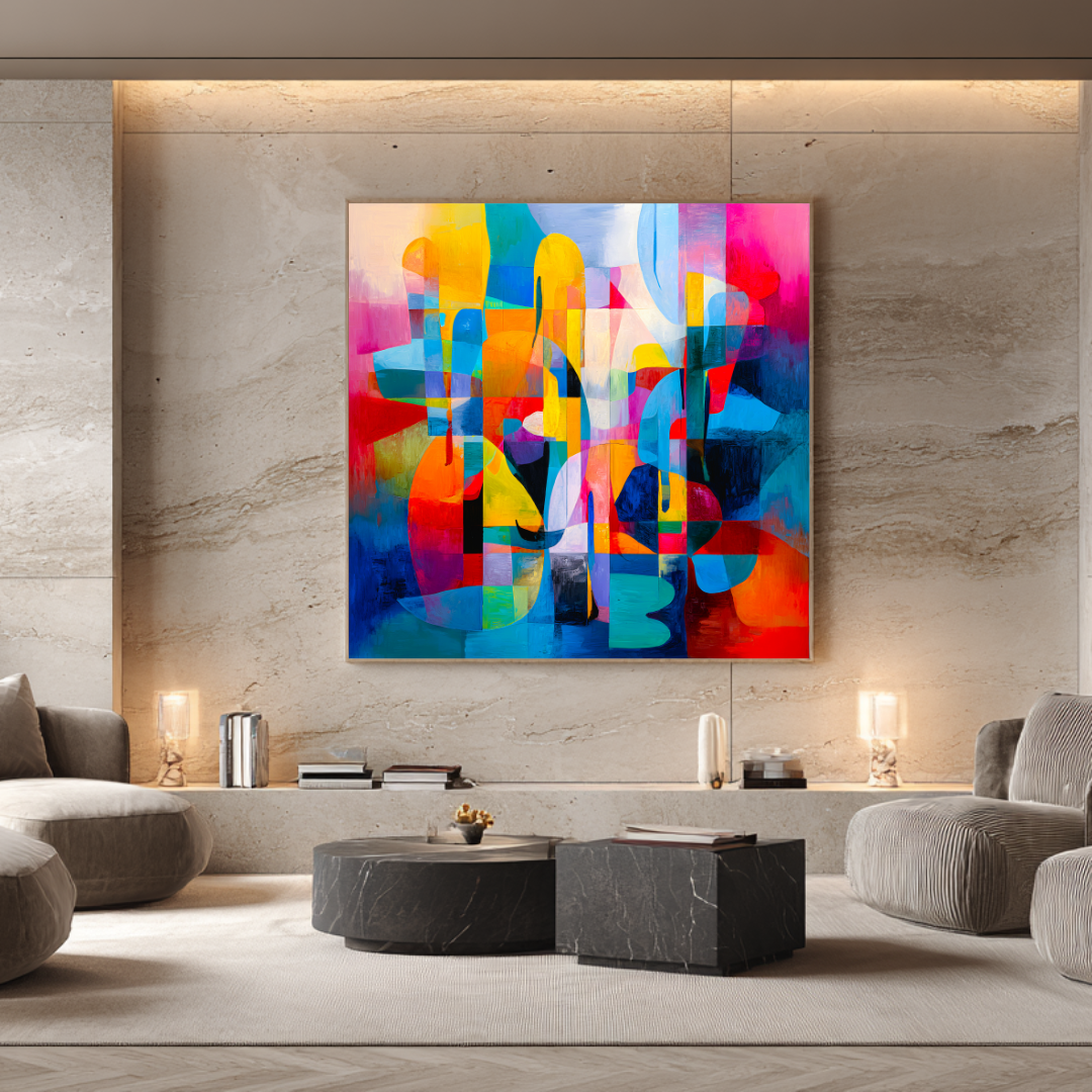
At this scale, a single canvas of 120–140 cm width works well for most standard sofa arrangements. A 120×120 cm square is the most versatile format — it sits comfortably above a 180–200 cm sofa and reads as a decisive statement without overwhelming the room’s proportions.
For open-plan apartments with longer walls and larger furniture arrangements, a pair of 120×120 cm canvases hung with deliberate spacing gives a total composition width of around 260–280 cm — significant enough to anchor a full-length sectional and fill the wall with genuine presence.
Large contemporary villa (150 m²+, 300 cm ceilings, Costa del Sol)
The challenge here is often the opposite of an apartment: too much wall, not too little. A room with 400 cm of open wall above a long sectional and 300 cm ceilings needs art at a scale that most people aren’t used to thinking about.
In these spaces, a single canvas of 150–180 cm width is where presence begins. Anything below that reads as a small gesture on a large surface. The 120×120 cm format that anchors an apartment living room beautifully becomes, in this context, something that needs to work as part of a pair or a larger arrangement.
For primary living rooms in larger villas — the kind of room that will be photographed for design media, that will be the first space guests experience — an original commissioned painting at the right scale is almost always the stronger choice. The ability to specify exact dimensions is significant when the wall is non-standard and you need something that fills it without being padded.
Double-height entrance hall
This is a specific situation that deserves specific treatment. A double-height entrance with 5–6 m of vertical wall space is, architecturally, a gift — and it needs art that treats it as such.
A single large canvas hung at conventional height disappears into this space. What works is either a monumental piece that engages with the full scale of the wall — potentially 200×250 cm or larger — or a vertical diptych of two related canvases hung with careful spacing that gives the eye a journey from the lower hanging point up through the space.
This is one situation where a commission conversation is almost always necessary before a decision is made. The format, scale, and placement need to work together as a single architectural decision, not as a standard art-hanging exercise.
Open-plan living and dining combined
The most common configuration in modern Spanish villas: a living area that flows into dining without a hard wall between them. In this setting, the question isn’t just about the sofa wall. It’s about which wall does the most work for the whole space.
Often the most effective approach is a single substantial piece on the primary living wall — the one that anchors the sofa arrangement — and a smaller related work in the dining area that echoes rather than duplicates the first. Same artist, same series, similar palette. Enough connection to feel considered, enough difference to give each space its own quality.
Part Three: One Large Canvas or a Diptych?
This is the question buyers ask most often, and the honest answer is that both are right in different circumstances.
When one piece is the stronger choice
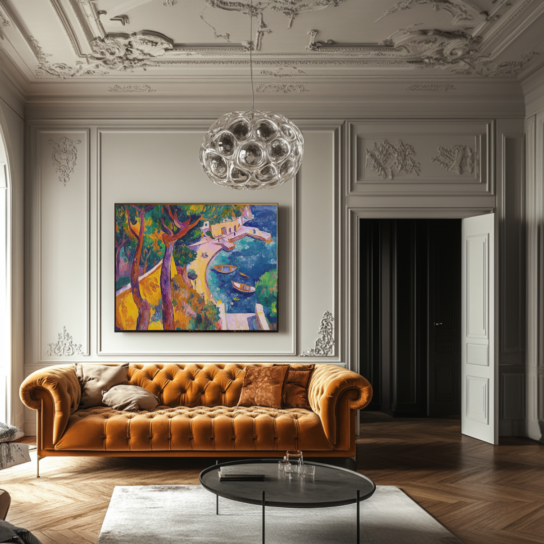
A single large canvas is the cleaner, more contemporary decision. One focal point. Fewer variables. And when it works — when the scale is right and the piece has sufficient presence — the room feels settled in a way that a more complex arrangement rarely achieves.
Choose one piece when:
- The wall is 300 cm or less and a single canvas at 60–75% of furniture width gets you to the right scale
- You want the simplest, most decisive visual statement
- The architecture is clean and modern — the kind that benefits from one strong gesture rather than visual complexity
- You’re hanging above a sofa of standard length (180–220 cm)
When a diptych is the stronger choice
A diptych — two related canvases displayed side by side, hung as a deliberate pair — solves problems that a single canvas can’t. It can cover more wall width without requiring a non-standard canvas size. It creates visual rhythm and movement across a long surface. And when the two pieces are genuinely related — same series, same palette, designed to work together — it can have more energy than a single work of equivalent total dimensions.
Choose a pair when:
- Your wall is 350 cm or wider and a single canvas would need to be impractically large
- Your furniture arrangement is long (240 cm+) and needs width to match
- You want movement and rhythm rather than a single focal point
- You’re working with a wide horizontal wall — a wall that has more width than height — where a single tall canvas would feel wrong
The critical thing with a diptych is that the two pieces must read as a deliberate composition, not two separate purchases that ended up next to each other. Same artist, same series, compatible formats. Hung close enough — typically 5–10 cm between canvases — that they read as one object rather than two.
What doesn’t work: the gallery wall in a primary space
A gallery wall — multiple smaller pieces arranged together — works in corridors, reading rooms, or studios. As a primary focal point in a main living room, particularly in a luxury interior, it usually reads as accumulation rather than intention. A primary living room wall benefits from decisiveness. A gallery wall is, by definition, a collection of undecided things.
There are exceptions. A curated arrangement of related works by a single artist, in a consistent format, hung with architectural precision, can read as considered. But that takes more skill to execute than a single strong piece, costs more to do well, and usually produces less impact.
For most buyers: one piece or a deliberate diptych. Not many small ones.
Part Four: What Large Canvas Art Costs — and What You’re Paying For
The range of prices for “canvas art” online is genuinely bewildering. You can spend €30 or €30,000 and find products described with similar language. What actually separates them?
Mass-produced décor prints (€30–€150)
These are poster-quality images printed in unlimited quantities on thin canvas or paper, typically by large online marketplaces. They may look acceptable in a product photograph. On a wall in a serious interior, they read as what they are: disposable décor. The materials don’t last, the production has no relationship to an original artwork, and there’s no edition control — the same image can be reproduced indefinitely.
There’s no meaningful investment case here, no provenance, and no reason for someone buying for a luxury interior to consider this tier.
Mid-market art prints (€150–€300)
This covers a wide range. At the bottom: slightly better production on better stock, still in unlimited editions. At the top: early limited editions from emerging artists, or open editions from mid-tier galleries on genuinely archival materials.
The key questions at this tier: Is the edition genuinely limited? Is there a direct relationship to an original artwork? What materials are being used, and what’s their longevity rating? If you can’t get clear answers to these questions, treat the product as an unlimited print regardless of how it’s described.
Limited edition giclée prints from working artists (€300–€500)
This is the tier Marta Ellie’s prints occupy, and it’s worth understanding what that price actually covers.
A 120×120 cm limited edition print from the collection is produced on 365 g/m² museum-quality canvas using archival pigment inks rated for 100+ year light stability under normal display conditions. The edition is limited to 20 copies. When 20 are sold, the edition closes permanently — no further copies are produced. Each print is hand-signed and numbered by Marta, with a certificate of authenticity.
At €300–€500, you’re paying for: archival production materials, an edition with genuine scarcity, direct provenance from the artist, and a piece of work that will hold a serious interior and hold up over time. You are not paying a gallery’s 40–60% commission, because there is no gallery.
For a home being furnished seriously, this is the entry point for art that belongs on the wall. Everything below it is decoration. Everything above it — original paintings — brings different qualities that may or may not be necessary depending on the space.
Original commissioned paintings (€3,000–€9,000+)
An original painting brings things a print cannot: the physical surface of hand-applied paint, the singularity of a work that exists only once, exact sizing to your wall, and a palette conversation specific to your interior.
For a primary living room in a significant property, the additional investment is usually justified. The room does more work. The scale can be exactly right. And you own something that cannot be replicated.
Marta’s commissioned originals start at €3,000 for smaller-scale works and scale with size and complexity. Large-format villa commissions typically fall in the €5,000–€9,000+ range. All include worldwide shipping, fully insured.
Part Five: Placement — The Rules That Are Easy to Get Wrong
Getting the size right and then hanging the piece incorrectly is the second most common mistake. These are the placement decisions that matter.
Hanging height
The centre of the canvas at 145–150 cm from the floor. Not the top. The centre. This is lower than most people instinctively place artwork, and it almost always looks better than higher — more connected to the room, less like it’s been placed near the ceiling to be safe.
The practical test: stand at the distance from which the room is normally experienced. Is the piece at a comfortable viewing angle, or are you tilting your chin up? If you’re looking up, it’s too high.
Gap above furniture
20–25 cm between the top of the furniture and the bottom of the canvas. This maintains a visual connection between the art and what’s beneath it. It also makes the wall feel taller — paradoxically, bringing the art down to where it belongs creates a sense of more space, not less.
What goes around it
For a statement canvas — large, strong, a genuine focal point — the default should be nothing. No candles, no decorative objects, no flanking pieces that compete for the eye’s attention. Let the work do its job.
Where flanking elements genuinely add something — a pair of wall lights, for example, that frame the canvas symmetrically and illuminate it — that’s a design decision, not an accessory reflex. Earn the addition. Default to clean.
Lighting the canvas
Natural light is the test. Art should hold up in whatever light the room actually has. But supplementary lighting — a dedicated picture light or directional spots — can transform how a painting reads after dark. For originals and museum-quality prints in significant spaces, it’s worth considering as part of the installation plan, not an afterthought.
Warm-spectrum lighting (2700–3000K) suits most abstract work, particularly work with warm palette. Cool-spectrum lighting can feel clinical with warm-toned paintings and is generally not the right choice for a living room context.
Part Six: Colour Guidance for Mediterranean Living Rooms
If you’re furnishing a home on the Costa del Sol — Marbella, Estepona, Sotogrande, Málaga — the light conditions are different enough from northern Europe to warrant specific guidance.
Mediterranean sun is directional, strong, and changes dramatically through the day. Colours that look sophisticated in a grey northern interior can read completely differently under Andalusian conditions: too intense at noon, too flat by evening, or — in the case of some highly saturated work — overwhelming in direct sunlight.
What works in strong southern light
Layered warm tones — ochre, terracotta, warm sand, burnt umber — are stable across the light cycle. They shift with the changing quality of light rather than fighting it. They hold at noon without washing out, and they remain interesting by candlelight in the evening.
Deep accents — indigo, forest green, charcoal, deep umber — provide contrast and depth. They pull the eye in rather than reflecting it. In strong light they read as anchors; in the evening they become the foundation that the lighter surface marks rest on.
Flat, high-saturation single colours tend to be difficult. In bright noon light they can feel aggressive. In evening light they can feel cold. Work with tonal range — where the eye finds different things at different light levels — performs better in these conditions than work that depends on one consistent reading.
This is one reason why technically layered painting suits Mediterranean interiors well. Work built the way the old masters built their canvases — ground, underlayer, glaze, surface mark — has depth that catches light rather than competing with it. It reads differently at 9 in the morning and at 7 in the evening, and both readings are interesting.
Relating art to wall colour
Abstract work has a dialogue with its background. This is not a detail — it’s a significant factor in how the piece reads.
Against a bright white or off-white wall (common in modern Spanish interiors), almost any palette can work. The wall is neutral; the painting provides all the colour. The risk is that warm-toned work can lose some of its warmth against a cool white. Ask for the wall’s specific white reference (the paint manufacturer and code) and check whether the whites in the palette are warm or cool.
Against a coloured wall — terracotta, dusty rose, sage green — the dialogue is more complex. Work that shares tones with the wall can disappear into it. Work that contrasts too sharply can create visual noise. The sweet spot is usually a piece that shares one or two tonal references with the wall colour while having its own distinct presence.
If you’re uncertain, contact the artist before buying. A photo of the room and the wall colour is enough to have a useful conversation about which works from the collection are likely to perform best.
Part Seven: About the Work — What You’re Buying Into
Marta Ellie was born in Kraków in 1985. She spent twenty years as a professional art restorer — working on paintings, sculptures, and religious works in churches and private collections across Poland — before moving to southern Spain and pivoting entirely to her own painting.
The restoration background is not incidental. It represents a level of technical knowledge about how paintings are physically built that most contemporary painters don’t have. An art restorer works on the inside of paintings — understanding where an artist changed their mind, how the ground affects the surface above it, why a particular glaze holds light differently than the pigment layer beneath it. Twenty years of that close looking gives you a different understanding of what makes a painting work, and why.
When Marta moved to Málaga, the Mediterranean light changed her work. The colour world she’d developed under the diffuse light of Polish winters didn’t translate. She rebuilt the palette from observation — the specific mineral blue of the coast, the ochre and sienna of the inland landscape, the bleached quality of noon light on white stucco, the orange that appears over the water in late afternoon.
The result is painting that carries both things: the technical construction of the European restoration tradition, and the direct colour experience of the Andalusian coast. Layered surfaces that hold light rather than just reflecting it. Work that reads differently across the day. Warmth that comes from observation rather than convention.
For a living room that needs to hold up across morning coffee and evening dinner parties and everything in between, that quality — painting that stays interesting across changing light conditions — is worth having.
Part Eight: Mistakes Worth Avoiding
Buying based on a cropped product image without checking dimensions
A 90×90 cm piece and a 120×120 cm piece look nearly identical in a product photograph taken against a white background. On your wall, they are completely different propositions. Always confirm physical dimensions in centimetres before purchasing. If a seller doesn’t display them clearly, ask.
Choosing art that’s narrower than half the sofa width
This is the visual equivalent of a rug that’s too small for the room. The piece floats on the wall without anchoring anything. The room looks less finished than it did before the art went up. Apply the 60–75% rule before you fall in love with anything.
Hanging it too high
The instinct to hang art high — as if high means important — is almost universal and almost always wrong. Centre at 145–150 cm from the floor. Test it before committing nail holes.
Adding too many elements around a statement canvas
If you’ve chosen something substantial and strong, give it room to work. Objects and accessories clustered around a statement canvas usually reduce its impact rather than completing it. The competition for attention doesn’t add up to more; it divides what was one decisive thing into noise.
Treating abstract work as neutral
Strong abstract painting has a mood. A room with a large energetic gestural canvas is a different room than one with a quiet layered field painting of similar dimensions. Buy for how the piece will feel on a Tuesday morning when you’re distracted and the light is flat. Not only for how it looked in the staging photograph.
Frequently Asked Questions
What counts as “large” canvas art for a living room? Generally 120 cm wide and above. In larger homes — villa open-plan spaces, rooms with generous proportions and high ceilings — 150–200 cm is where presence begins. A 120×120 cm canvas is the right entry point for most standard-sized living rooms; it performs differently in a 400 m² villa with 340 cm ceilings.
Can a square canvas work above a long sofa? Yes, at sufficient scale. A 120×120 cm piece works comfortably above most sofas up to 200 cm. For longer arrangements — 240 cm or more — the square format can work as part of a deliberate pair. A single square below the 60% threshold for a very long sofa will look undersized.
Should living room art match the room’s colours? It should relate, not match. Work that shares tonal references with the room’s palette while having its own distinct presence will feel connected to the interior without disappearing into it. Work that matches too closely reads as decoration. Work that contrasts too sharply reads as an argument. The balance — same language, different sentence — is what you’re looking for.
Is one large canvas better than a gallery wall? For a primary living room focal point, almost always yes. A gallery wall in a main room reads as accumulation. A single considered piece at the right scale reads as a decision. The exception is a very deliberately curated arrangement of related works by one artist — but that’s harder to execute and usually costs more to do well.
Is commissioned art worth it for a main living room? For a flagship room in a significant property, usually yes. Exact sizing, a tailored palette conversation, a work that exists only in your home — these are things a print, however good, can’t provide. For secondary rooms or for buyers building a collection over time, limited edition prints are the right entry point. Many buyers combine both: one original for the primary statement wall, prints for the rooms around it.
Do you ship large canvas prints internationally? Yes. Limited edition prints ship worldwide from Marta’s studio in Málaga, fully insured. Original commissions are shipped via specialist art transport.
How do I start a commission conversation? Use the commissions enquiry page. Share basic information about your space — wall dimensions, room type, any constraints on palette or format — and Marta will respond within 48 hours with an initial view on what might work and what the process would look like.
What to Do Next
If you have the dimensions and you’re ready to browse: the prints collection shows all available limited edition works with physical dimensions, edition status, and pricing. Some editions are already sold through. When an edition of 20 closes, it closes.
If you have a specific space in mind and want to talk through scale, format, or whether a commission is the right route: the commissions page is the starting point. First conversation costs nothing. It’s just a conversation about fit.
If you’re still working out the basics — what size, what format, what style, what budget — there are more guides on the blog that cover the specifics:
- Abstract wall art: choosing pieces that transform a room — full guide to abstract art decisions specifically
- Original paintings vs art prints — honest comparison for buyers deciding between the two
- Canvas print size guide — room-by-room sizing breakdown
- How to commission a painting — what the process looks like from first contact to delivery
All prints ship worldwide from Málaga, fully insured. Commission enquiries are answered within 48 hours.
From the collection
Prints related to this guide
Limited editions of 20 · Giclée on 365 g/m² canvas · Signed by Marta Ellie
Abstract & Modern
Metamorphosis
€325
Abstract & Modern
Dreams
€300
Coastal & Mediterranean
Harbor of Dreams
€350
Read next
Ready to find yours?
Museum-quality prints, from €300.
Limited editions of 20. Giclée on 365 g/m² canvas. Shipped worldwide from the studio in Málaga.
More articles