Buying Guide
Landscape Paintings for Sale: A Complete Guide to Buying Work That Lasts
11 April 2026
Landscape paintings remain one of the most enduring choices for a serious interior. Not because they’re safe — the wrong landscape can flatten a room as effectively as the right one can open it up — but because a well-chosen landscape does something that purely abstract or purely decorative work doesn’t always achieve. It gives the room a sense of place. It adds depth. It gives the eye somewhere to travel and rest.
The problem isn’t the category. The problem is that “landscape paintings” covers an enormous range: from atmospheric, layered paintings with genuine surface quality and tonal complexity, to mass-produced hotel-corridor images with flat colour and no particular relationship to anywhere real. Choosing between them requires knowing what you’re looking at — and knowing what you actually need the work to do in the room.
This guide covers the full decision: which landscape style works in which interior, how to size correctly, what separates a limited edition print worth owning from a production print that won’t hold a serious space, when an original commission makes sense, what price reflects what quality, and how to buy directly from a working artist without the gallery layer between you.
Part One: Why Landscape Still Works — and When It Doesn’t
Before style, before sizing, before price: understanding what landscape painting actually contributes to an interior, and where it falls short.
What landscape does well
A landscape — even a highly abstracted one where the subject is felt rather than literally depicted — brings atmospheric depth that purely non-representational work doesn’t always have. There’s a horizon, or the suggestion of one. There’s light coming from somewhere. There’s a sense of scale that makes a room feel larger rather than smaller.
In the right space, this is powerful. A painting that reads as coastal or Mediterranean on a wall in a Marbella villa isn’t decoration — it’s a continuation of the landscape the house is already embedded in. The interior and the exterior have a conversation. The work belongs rather than having been brought in from somewhere unrelated.
Landscape also tends to be more immediately accessible than pure abstraction. This isn’t a weakness. For a room that needs to work for people with different relationships to art — a client’s home, a guest bedroom in a luxury villa, a shared space — landscape painting communicates without requiring a frame of reference.
Where landscape painting fails
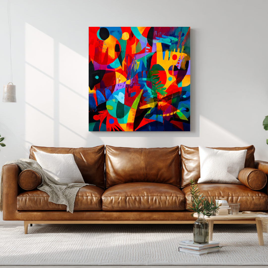
The failure mode is genericness. Landscape art is the category most saturated with work designed not to offend — flat colour, legible subject, no surface complexity, no particular point of view. This is what fills hotel corridors and short-term rental apartments. It’s technically a landscape. It adds nothing to the room except the impression that someone made a decision when they didn’t.
The distinction between a landscape painting that transforms a room and one that merely occupies wall space comes down to a few things: surface quality, tonal range, the sense that someone looked at an actual place and made actual marks in response to it. Photographic accuracy is not the measure. A highly abstracted painting of a coastline can be far more present, far more alive, than a technically accurate rendering of the same scene.
The test: does the painting look different from across the room than it does close up? Does it look different in morning light than in evening light? Does it reward attention over time, or does it give you everything it has in the first five seconds? Work that passes that test belongs in a serious interior. Work that doesn’t belongs somewhere else.
Part Two: Which Landscape Style Works in Which Interior
Landscape painting is not a single thing. The range — from almost-photographic realism to near-abstract colour fields where the landscape is barely implied — is wider than most other categories. Matching style to interior type is the first real decision.
Atmospheric abstract landscapes
These are works where the landscape is suggested rather than depicted. A horizon line implied by a tonal shift. The quality of coastal light rendered through colour temperature and surface mark rather than identifiable shapes. The sense of looking at a shoreline or a hillside without being shown one explicitly.
This style works best in modern, minimal interiors with clean architecture — particularly in contemporary Spanish villas with white walls, polished concrete, and an absence of decorative clutter. The painting does the atmospheric work without adding visual noise. It feels like a decision about the room’s quality rather than a choice of subject matter.
What to avoid with this style: interiors that are already visually complex. A heavily patterned room, lots of decorative objects, textured wallcoverings — these contexts compete with an atmospheric painting rather than letting it do its work. Atmospheric abstraction needs space around it.
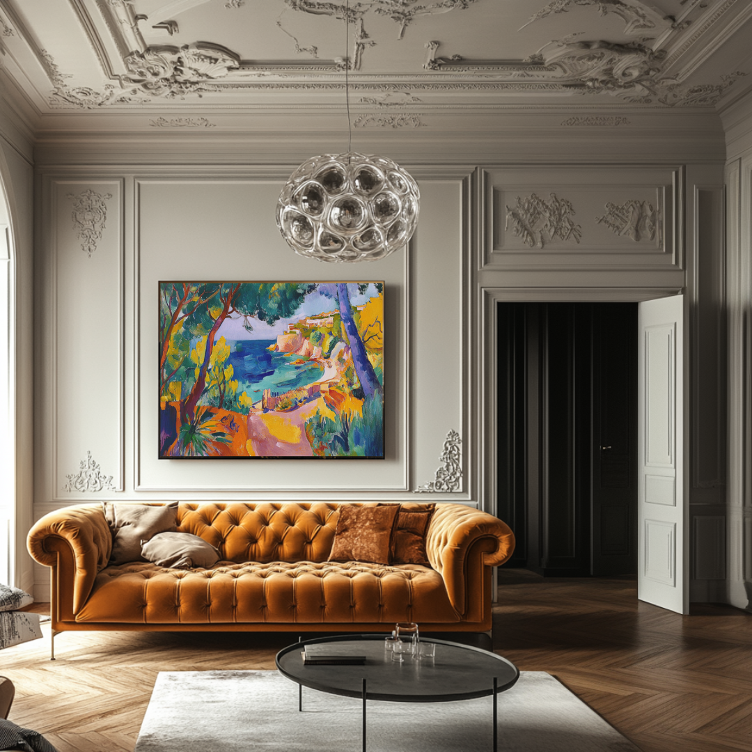
Coastal and Mediterranean palette work
This is a specific subset of landscape painting built around the colour experience of Mediterranean coastlines: mineral blues, sea greens, bleached sandy neutrals, warm ochres, the particular quality of late-afternoon orange light on white stone. The subject matter is recognisable — water, coast, sky, the specific light of this part of the world — but the execution varies from loose and gestural to more structured.
For homes on the Costa del Sol — Marbella, Estepona, Sotogrande, Málaga, Benahavís — this style has an obvious resonance. It’s not just that the colours relate to the exterior landscape; it’s that the painting and the place are in dialogue. A coastal work on the wall of a villa overlooking the sea feels like it grew there rather than being imported.
It also performs well in the specific light conditions of the region. Mediterranean sun is strong and directional, and it changes dramatically across the day. Cool colours can feel washed out at noon and cold by evening. Warm coastal palettes — ochre, sand, warm white, mineral blue — hold across the light cycle in a way that more saturated or cooler work often doesn’t. More on light conditions in Part Five.
Layered earth-tone landscapes
These are works built around the inland Mediterranean palette: ochre and burnt sienna, sage green, warm umber, the particular olive-brown of Spanish hills in July, the grey-white of limestone and dried grass. The palette is warm, dry, and grounded.
This style works particularly well in interiors built around natural materials — stone floors, linen textiles, unpolished wood, aged terracotta. The painting extends the room’s palette rather than interrupting it. It’s not doing something different from the room; it’s doing more of the same thing, at a higher level of intensity.
In these interiors, the risk with this style is disappearing — if the palette is too similar to the walls and furnishings, the work becomes texture rather than painting. The solution is ensuring the work has tonal range: lights and darks, depth and surface, enough movement across the canvas that the eye finds something to follow even against a sympathetic background.
What to avoid: the hotel landscape
There’s a specific type of landscape painting that exists in enormous quantities online and in décor retail: the painting with a recognisable landscape subject (cliffs, a lake, a field, a beach), executed in smooth, flat brushwork with limited tonal range, pleasant colour, and no particular point of view.
This work is designed to not offend. It communicates “art on wall” without creating any friction. And it adds almost nothing to a serious interior — because it has nothing to add. The room doesn’t become more interesting with it. The wall doesn’t gain presence. It’s the visual equivalent of filler.
If you’re spending serious money on serious wall space, the test isn’t whether a landscape is inoffensive. It’s whether it’s alive.
Part Three: Sizing Landscape Art Correctly
The principles here are the same as for any large wall artwork, but landscape format introduces some additional considerations — particularly around orientation.
The core measurement
Start with the furniture beneath the wall, not the wall itself. The target: artwork width at 60–75% of furniture width. For a 240 cm sofa, that’s approximately 145–180 cm total artwork width. For a 200 cm sideboard or console, roughly 120–150 cm.
| Furniture width | Target artwork width |
|---|---|
| 160–180 cm | 95–130 cm |
| 200–220 cm | 120–160 cm |
| 240–280 cm | 145–200 cm |
| 300 cm+ | 180 cm+ or a pair |
If the landscape will hang on a wall without furniture directly beneath it — a stairwell, an entrance hall, a dining room wall — use the wall width as the reference point instead. A piece that fills 50–65% of a wall with no furniture relationship is the working principle.
Format: horizontal, vertical, or square
Landscape paintings traditionally favour horizontal formats — which makes sense, since the landscape itself is usually wider than it is tall. A horizontal canvas above a sofa echoes the horizon. It grounds the room rather than pulling the eye upward.
But format should match the wall, not just the convention:
Horizontal formats work best above long furniture — sofas, sideboards, credenzas — and on walls with low-to-standard ceilings. They create calm and breadth.
Vertical formats work well in narrow walls, stairwells, or spaces with high ceilings where the architecture already has a strong vertical quality. A vertical landscape (a cliff face, a stand of trees, a long view through a window) can use that height rather than fight it.
Square formats are the most versatile and tend to suit contemporary interiors well. A square landscape — where the composition finds its horizon within a contained shape — works in a wide range of wall contexts. Marta’s limited edition prints are produced at 120×120 cm for this reason: the square format hangs well above standard sofas, pairs cleanly as a diptych on wider walls, and suits the architectural quality of most contemporary villa and apartment interiors.
One piece or a pair
For walls 300 cm or wider with long furniture beneath them, a single landscape painting often needs to be very large to hit the 60–75% target — potentially 180–200 cm wide. That’s achievable in an original commission (any dimension is possible) but not in a standard print format.
The practical alternative is two related works hung as a deliberate pair. Two 120×120 cm prints hung with 8–10 cm between them gives a total composition width of approximately 250 cm — enough to anchor a long sectional or a full-width wall in a generous room. The pair must read as a deliberate composition: same series, same artist, compatible palettes. Close enough together that they read as one object.
For double-height walls — entrance halls, stairwells in larger villas — the format question is primarily about scale rather than width. A large vertical landscape or a tall diptych that engages with the vertical dimension of the space is almost always more effective than a conventional horizontal piece hung at standard height and surrounded by empty wall.
Part Four: Limited Edition Prints vs Original Paintings
This decision comes up for most buyers, and the honest answer is that both are right — for different spaces and different purposes.
What a limited edition landscape print actually is
Marta’s landscape and coastal prints are produced as limited editions of 20 copies each. Production is on 365 g/m² museum-quality canvas using archival pigment inks rated for 100+ year light stability under normal display conditions. Each print is hand-signed and numbered by Marta, with a certificate of authenticity. When 20 copies sell, the edition closes permanently.
This is not a mass-produced décor print. The difference — in material quality, surface presence, and what happens to the piece over time — is significant and visible on the wall.
At €300–€500 for a 120×120 cm work, you’re buying: archival production on museum-quality materials, a genuinely limited edition, direct provenance from the artist, and worldwide shipping fully insured. There’s no gallery commission between you and the maker — which means the price reflects the work, not the distribution chain.
What an original landscape commission provides
An original painting brings three things a print cannot:
Physical singularity. The painting exists once. The specific surface — the marks, the layers, the texture of paint on canvas — is unrepeatable. You own the only one.
Exact sizing. A commission can be made at any dimension the wall requires. If your wall calls for a 200×120 cm horizontal landscape, that’s what gets painted. No print format can match that specificity.
A tailored brief. A commission begins with a conversation about the space: wall dimensions, light conditions, palette references from the rest of the room, the mood the space is trying to achieve. The painting that results is a direct response to that brief. It’s not chosen from a collection; it’s made for your wall.
For the primary focal room in a significant property — the main living room of a villa, a double-height entrance, a space that will be photographed — an original is usually the right choice. The difference is visible, and it justifies the investment.
For secondary rooms, guest rooms, studies, or buyers building a collection across multiple spaces at a measured pace, limited edition prints are the right entry point. They’re not a compromise. They’re the appropriate solution for those contexts.
The combination approach
Many buyers who furnish larger homes do something practical: one original landscape or coastal painting for the primary wall — the room the house is built around — and curated limited edition prints for the spaces that surround it. Same artist, same body of work, coherent across the whole interior. One investment at original scale where it matters most; prints where presence is important but singularity is less critical.
Part Five: Colour and Light — Buying Landscape Painting for Mediterranean Homes
If you’re buying landscape art for a home on the Costa del Sol, the light conditions are specific enough to be worth addressing directly.
Andalusian light is not northern European light. It’s stronger, more directional, and it changes more dramatically across the day. At noon in summer it’s almost overhead and intense. By late afternoon it’s coming in low and warm through west-facing windows, casting everything in a particular orange quality. By evening it’s gone, and the room is artificial light.
Paintings that hold up across that light cycle are different from paintings that look good in one condition and difficult in another.
What works under strong southern light
Warm layered palettes — ochre, terracotta, warm sand, burnt sienna, warm whites — are stable across the full light cycle. They absorb and reflect Mediterranean sun without washing out at noon or going flat in the evening. They shift as the light changes, which is what makes them interesting to live with across years rather than months.
Tonal depth matters more than hue. Work with genuine range — dark grounds, lighter mid-tones, bright surface marks — catches light without being flattened by it. The light picks out different things at different times of day. Strong noon light hits the surface marks; morning light reveals the mid-tones; evening light makes the deep colours come forward. This is how the best painting behaves, and it’s not accidental.
Highly saturated, single-note colour is difficult in this context. A painting built around one intense hue — a flat saturated blue, a solid green — can feel aggressive at noon and cold at dusk. It gives you one reading, repeated forever. In strong light, that gets exhausting.
Cool palettes can work, but require more care. Mineral blue and sea-glass green are constants in coastal landscape work, and they suit Mediterranean interiors well. The key is that they’re part of a warm composition rather than the entire palette — grounded by ochre, warm sand, or raw linen tones that prevent the work from reading cold in evening light.
Coastal landscape and the interior context
For homes directly on or near the Costa del Sol coastline, the relationship between a coastal landscape on the wall and the view from the window is worth thinking about deliberately.
Some buyers want the painting to echo the exterior — a coastal work that speaks to the same sea and light visible through the window. This creates continuity, a sense that the interior and exterior are one environment. It works particularly well when the view is partial or framed — when the sea is glimpsed rather than panoramic.
Other buyers want contrast — an inland landscape, an earth-tone composition, something that provides a counterpoint to an exterior that is already doing the work of a view. This works when the view is the statement and the interior needs grounding rather than echo.
Neither is wrong. The question is what the room needs from the painting — and that’s usually clearer once you’re standing in the space and looking at the wall rather than browsing online.
Part Six: What Drives Price in Landscape Painting
The range of prices for landscape paintings online is wide enough to be confusing. €40 and €4,000 can both be described as “landscape art” in online search results. Understanding what drives price at different levels makes the decision easier.
Size
This is the most direct factor. A large canvas requires more time, more material, and more sustained concentration than a small one. The physical act of painting a 200×150 cm landscape is categorically different from painting a 60×60 cm work — not just more of the same thing. Pricing scales accordingly.
For prints, size also matters, but within the context of a standard production run. Most quality giclée prints are produced in standard formats; non-standard sizes typically require custom production and are priced higher.
Medium: oil vs acrylic
Oil paint develops surface complexity over time in ways acrylic doesn’t. The slow drying time allows for extended blending, subtle glazing, and a luminosity — the way light moves through the paint layers — that’s specific to oil. Oil commissions take longer to produce and are generally priced 20–40% higher than equivalent acrylic works.
This doesn’t make acrylic inferior. Acrylic has qualities oil doesn’t — faster drying allows for different mark-making, different layering sequences, a different kind of surface. But for buyers who prioritise the specific surface quality of traditional painting — and who understand the difference — oil is the relevant comparison.
The artist’s track record
Twenty years of professional practice, a body of work with collectors across multiple countries, work in private and institutional collections — this is not just biography. It represents genuine value in a market where it’s easy to overpay for inexperience.
When you buy from an artist with a serious track record, you’re buying into a body of work that has been tested over time. The prices reflect the artist’s position in the market, not just the cost of making the object. This is why prices from serious working artists start where they do — and why they’re worth it relative to alternatives at similar price points from different sources.
Edition size for prints
A limited edition of 20 copies behaves differently in the market than an open edition of unlimited copies. Scarcity is real. As editions sell through, the remaining copies become genuinely rarer. Buyers who acquire early are acquiring into a controlled release. This matters for investment behaviour, but also for the simple fact that owning print 4/20 is different from owning a print that is one of ten thousand.
Summary by tier
| Type | Price range | What you’re getting |
|---|---|---|
| Mass-produced décor prints | €30–€150 | Unlimited edition, non-archival, no provenance |
| Mid-market open editions | €150–€300 | Better production, variable edition control |
| Limited edition giclée prints | €300–€500 | Archival, 20-copy edition, signed, direct provenance |
| Original commissioned paintings | €3,000–€9,000+ | Hand-painted, singular, exact sizing, tailored brief |
Part Seven: About the Work — Marta Ellie’s Landscape and Coastal Series
Marta Ellie was born in Kraków in 1985. She trained as a painter and spent twenty years working as a professional art restorer — on paintings, sculptures, and religious works in churches and private collections across Poland. She also taught art. When she moved to Málaga and encountered Mediterranean light for the first time, the work changed.
The restoration background is what makes the technical quality of her landscape work distinctive. An art restorer works on the inside of paintings — learning why the great painters built their surfaces the way they did, how a ground layer affects the colour above it, how a glaze holds light differently from a direct mark, why some paintings are still alive after four hundred years and others have crumbled. Twenty years of that kind of close looking produces a technical understanding of painting that no art school course replicates.
Her landscape and coastal work comes directly from observation of the Andalusian environment. The mineral blue of the Mediterranean off the Estepona coast. The specific bleached quality of noon light on white limestone. The ochre and raw sienna of the inland hills in August. The orange that appears on the water in late September at six in the evening. These aren’t palette choices made in the abstract. They’re the result of years of looking at a specific place in a specific light, and building the technical means to hold those observations on canvas.
The Coastal & Mediterranean series is the most directly place-based: loose, gestural, built from mark and colour rather than literal depiction. It suits homes in this region with a particular directness — not because the subjects match the location, but because the paintings were made in the same light that falls through those windows.
The wider landscape work sits between direct observation and abstraction — compositions that have a clear atmospheric basis (a horizon, a quality of sky, the pressure of light on a surface) without resolving into illustration. These suit a wider range of interior contexts and are what most buyers with a serious contemporary interior are looking for when they say they want landscape without cliché.
Part Eight: How to Buy Directly from the Artist
For most buyers in this category — people spending seriously on serious wall space — buying directly from a working artist is better than any alternative. Here’s why, and how it works in practice.
Why direct matters
Provenance is simple. You bought this piece from the person who made it. The certificate, the signature, the edition number — all of it comes directly from the source. There is no chain to trace, no question about authenticity, no possibility of misrepresentation.
The advice is real. When you ask how a print behaves in strong afternoon light, or whether a particular piece would suit a terracotta-walled room, the answer comes from someone who knows exactly how the work was made and what it does in different conditions. Gallery staff can sometimes approximate this. Artists can actually answer it.
No gallery commission. Galleries typically take 40–60% of sale price. Buying direct means the price you pay is the artist’s price. You’re paying for the work, not for the infrastructure around it.
A relationship with the work. When you buy from the artist, you understand what you bought. You may have seen work-in-progress images, had a conversation about the palette, heard what the series was responding to. That knowledge is part of how you experience the piece on the wall — not just on the day it arrives, but every day after.
How the process works
For prints: Browse the collection. Check dimensions (displayed in centimetres), check edition status (some editions are already partially or fully sold through), and buy directly. Prints ship worldwide from Málaga, fully insured, typically within 5–7 working days.
For commissions: Start with the commissions page. Share basic information about the space: wall dimensions, room type, light conditions, any palette constraints. Marta responds within 48 hours with an initial view on what might work and what the process looks like. No obligation in the first conversation. It’s a conversation about fit.
Part Nine: Mistakes Worth Avoiding
Prioritising subject over surface quality
A painting of a beautiful place with no surface quality is less interesting on the wall than a painting of nothing in particular with genuine tonal complexity and mark. Buy for the painting, not for the subject.
Buying at a scale that’s too small
The 60–75% rule exists for good reason. A landscape painting that looks impressive as a product image at 90 cm wide looks tentative and unconsidered above a 240 cm sofa. Measure first. Then browse.
Choosing palette for a photo, not for your actual light
A painting photographed on a white background in studio light will look different in your room under your light conditions. If you’re buying for a south-facing room in Málaga, consider how the palette will behave in strong afternoon sun. If you’re uncertain, ask.
Treating all prints as equivalent
There is a wide range inside the category called “art prints.” An archival giclée on 365 g/m² museum canvas in a limited edition of 20 is not the same object as a €45 poster described as a canvas print. The difference is visible on the wall and in how the piece holds up over time.
Expecting a literal subject to do what a painterly piece does
A landscape painting that shows you a recognisable view — the Rock of Gibraltar, the Málaga coastline, the Alhambra — will give you that view, forever. A landscape painting that gives you the feeling of this coast without depicting it specifically will give you something different to find every time you look. Know which one you actually want before you spend money on the other.
Frequently Asked Questions
Are landscape paintings relevant for contemporary interiors? Yes — particularly atmospheric and abstracted landscape work. The most sophisticated contemporary interiors use landscape painting precisely because it adds depth and atmosphere without looking trend-driven. A well-chosen landscape feels timeless; a trend-driven abstract may not.
What size landscape painting for a large wall? Start around 120–140 cm wide for most living room walls; scale up to 160–200 cm for wide walls or large furniture arrangements. Very wide walls (300 cm+) often suit a deliberate pair of related works better than a single very large canvas.
Print or original for a main living room? For a flagship space where scale, singularity, and surface quality are important — an original. For secondary rooms or for buyers building a collection at a measured pace — a quality limited edition print. Many buyers do both across a property.
How do I avoid buying generic landscape art? Buy from artists with a clear, consistent body of work and genuine technical credentials. Look for work that reads differently close up and from across the room. If the painting gives you everything it has in the first five seconds, it will be boring on the wall within a year.
Do you take landscape commissions for specific locations? Yes. A commission brief can include a specific place, a specific quality of light, a particular palette drawn from the site. The work won’t be illustrative — it won’t be a photographic rendering — but it can be deeply responsive to a particular place. That’s what the restoration background and twenty years of observation make possible.
Do you ship internationally? Yes. Prints ship worldwide from Málaga, fully insured. Original commissions ship via specialist art transport, also fully insured.
What to Do Next
If you’re ready to browse: the prints collection shows all available landscape and coastal editions with physical dimensions, edition status, and pricing. Editions sell through in 20 copies and close. If a piece you want is already sold, it’s gone.
If you have a specific wall in mind: the commissions page is the starting point for a conversation about scale, palette, and format. First conversation costs nothing and carries no obligation.
If you’re still deciding on approach, these guides cover adjacent decisions:
- Large canvas art for living rooms — sizing and placement in full detail
- Abstract wall art: choosing pieces that transform a room — for buyers considering abstract over representational
- Original paintings vs art prints — honest comparison of both options
- Luxury wall art for Costa del Sol villas — specifically for Mediterranean home contexts
Prints ship worldwide from Málaga, fully insured. Commission enquiries answered within 48 hours.
From the collection
Prints related to this guide
Limited editions of 20 · Giclée on 365 g/m² canvas · Signed by Marta Ellie
View All Prints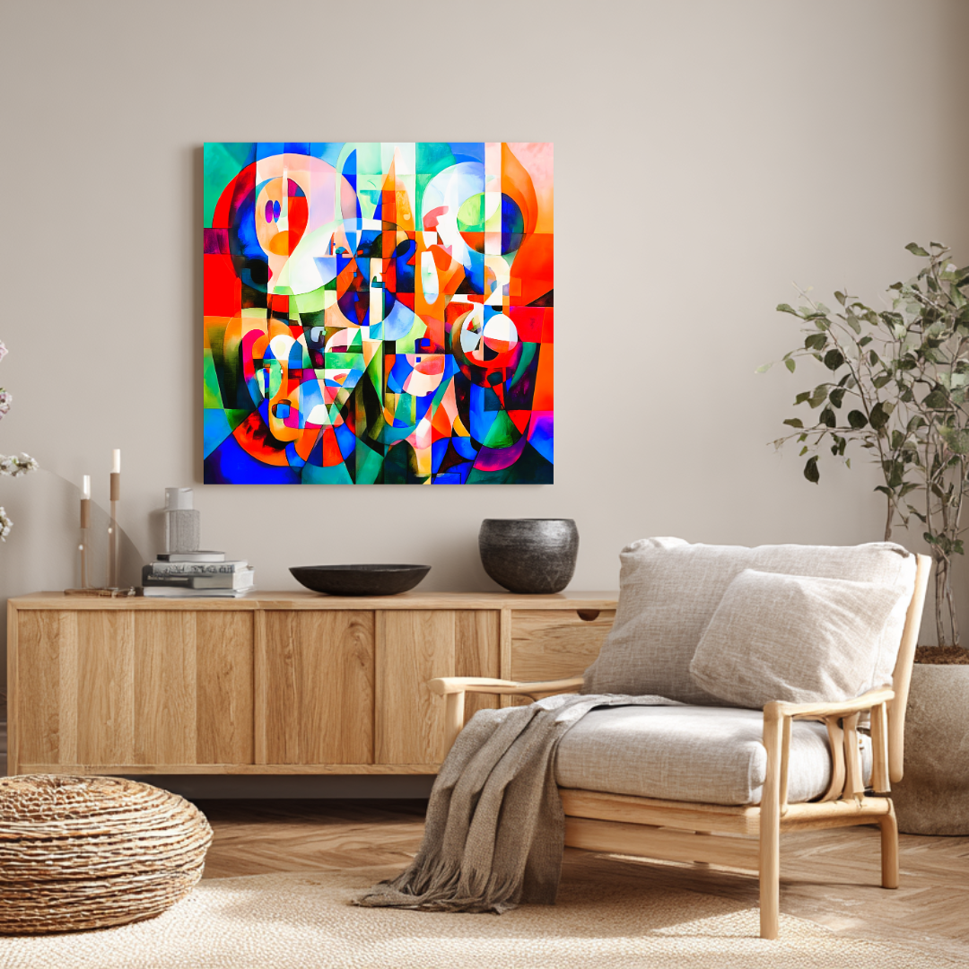
Read next
Ready to find yours?
Museum-quality prints, from €300.
Limited editions of 20. Giclée on 365 g/m² canvas. Shipped worldwide from the studio in Málaga.
More articles