Buying Guide
Abstract Wall Art: The Complete Guide to Choosing, Sizing, and Buying Pieces That Last
11 April 2026
Most abstract art fails a room not because it’s the wrong style, but because it’s the wrong size.
A piece that looks impressive on a screen — rich colours, strong composition, something with genuine presence — hangs tentatively on the wall. Not because the work is weak. Because the scale is off. And once it’s on the wall, you live with that mismatch every day.
This guide exists to prevent that. It covers everything you need to make a confident decision: how to size abstract art properly, how colour behaves in Mediterranean light, what separates a limited edition print worth owning from mass-produced décor, when a commissioned original makes sense and when it doesn’t, and what the art-buying process actually looks like when you go directly to the artist.
If you’re furnishing a villa on the Costa del Sol, working with an interior designer on a high-end residential project, or simply trying to choose something significant for a room that matters — this is the guide to work through before you buy.
Who This Guide Is For
The people who tend to find this page are usually doing serious research before spending serious money. They’re not looking for something to fill a gap on the wall. They want something that earns its place — that holds attention, that still feels right in five years, that says something about the taste of the person who chose it.
That might be a homeowner finishing a villa in Marbella or Estepona and wanting the main living room to feel complete. It might be an interior designer sourcing a focal-point artwork for a client who doesn’t want to see the same print in every other Costa del Sol rental apartment. Or it might be someone who’s been buying from galleries and auctions and wants, for once, to buy directly from the artist and skip the layers of markup and uncertainty in between.
This guide is written for all of them. And it’s written by a working artist who has been on the other side of every conversation in it.
Part One: Scale — The Rule That Overrides Everything Else
Before you look at a single image, look at your wall.
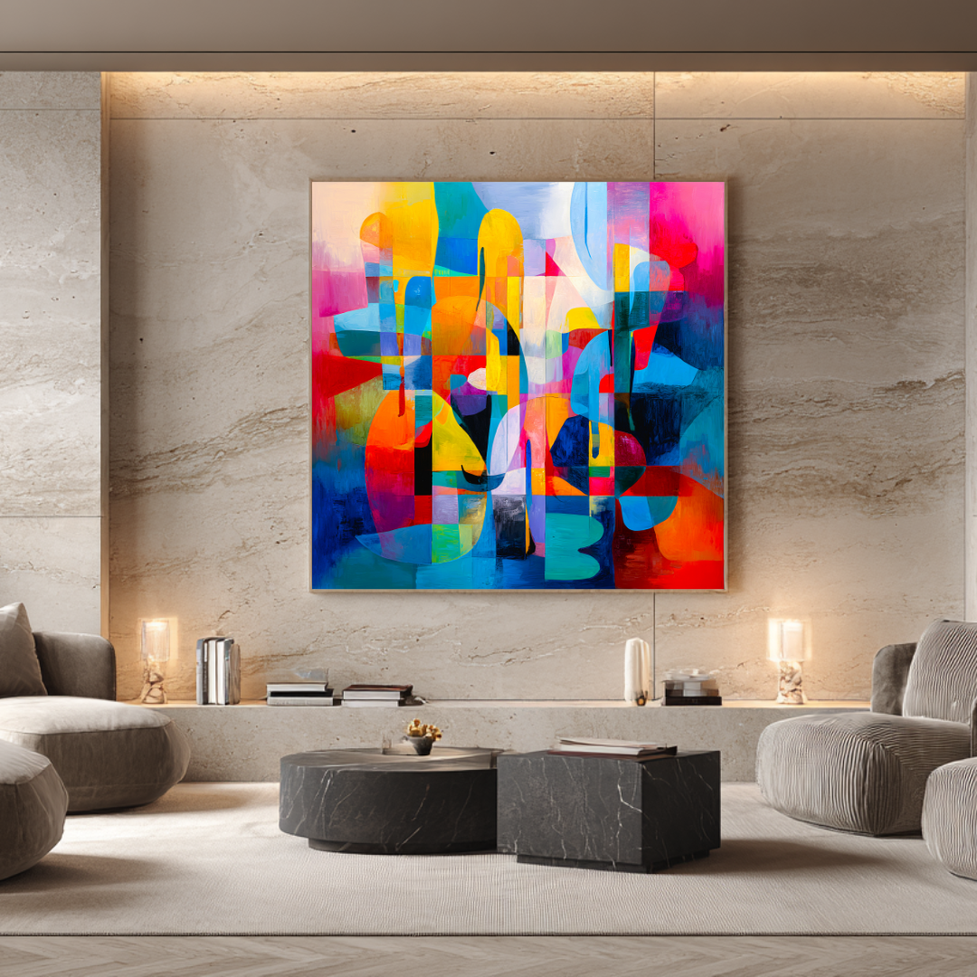
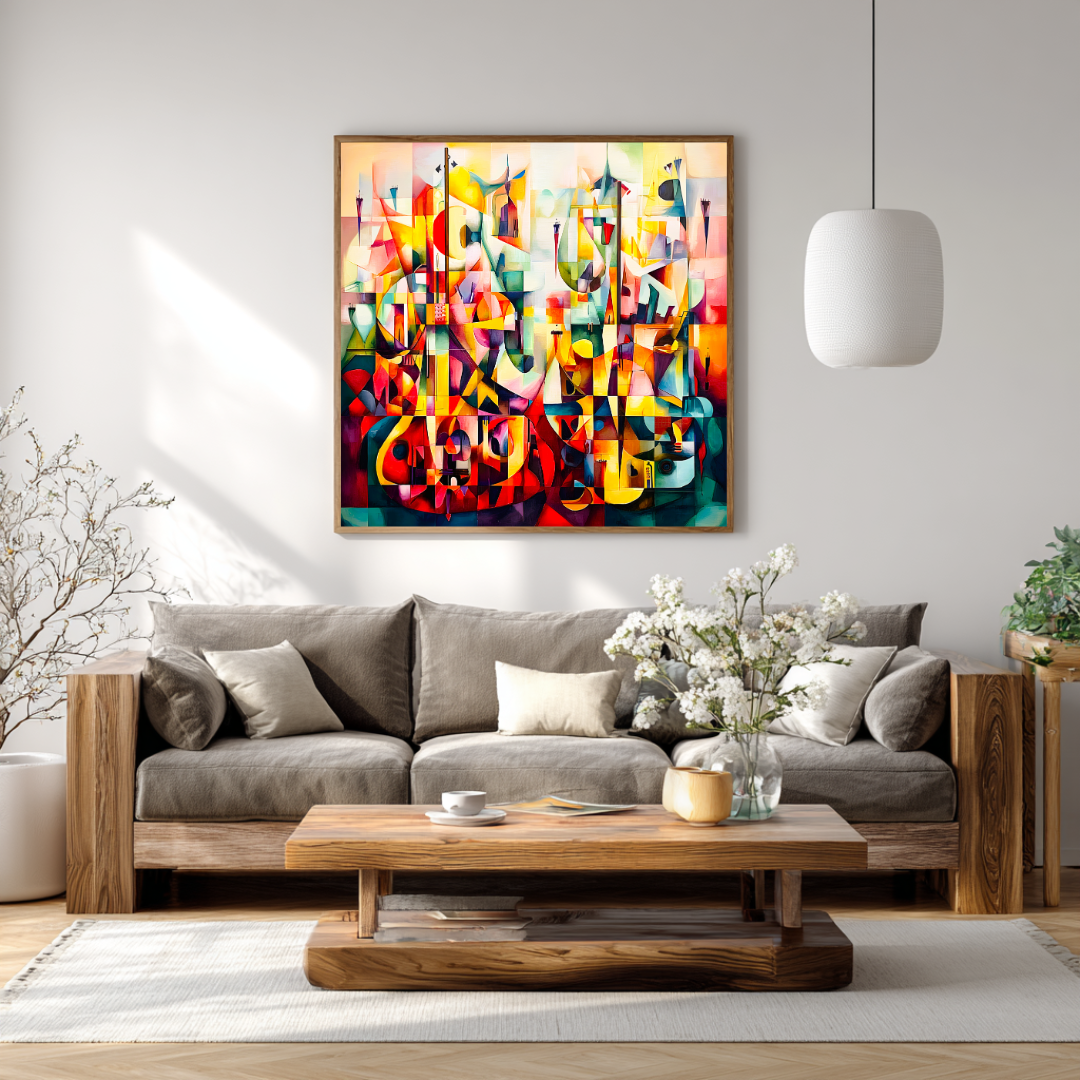
Measure the width of the furniture beneath the hanging space. If it’s a sofa, measure the sofa. If it’s a sideboard, measure that. Then calculate 60–75% of that width. That’s the target width for your artwork — whether it’s a single piece or two works hung as a pair.
This isn’t a suggestion. It’s the most reliable principle in art placement, and it’s the one most people ignore because it feels counterintuitive. A large number on a measuring tape feels bold. But on a wall, anything below 60% of the furniture width reads as decoration, not statement.
The numbers
| Wall situation | Furniture width | Target artwork width |
|---|---|---|
| Above a standard sofa | 200 cm | 120–150 cm |
| Above a large sectional | 240–300 cm | 145–200 cm |
| Double-height entrance | — | 180 cm+ or diptych |
| Dining room, above credenza | 160–200 cm | 100–140 cm |
| Bedroom, above headboard | 150–200 cm | 90–150 cm |
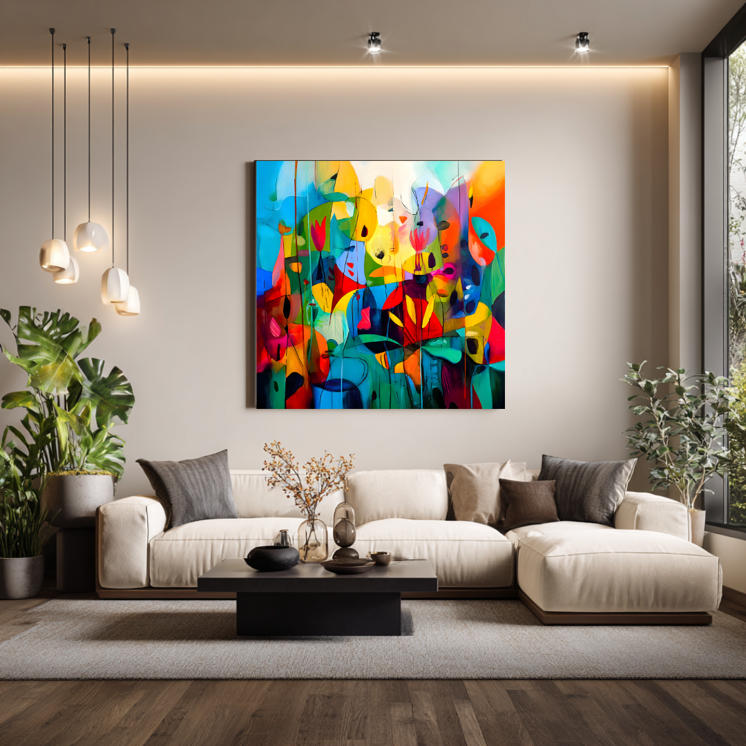
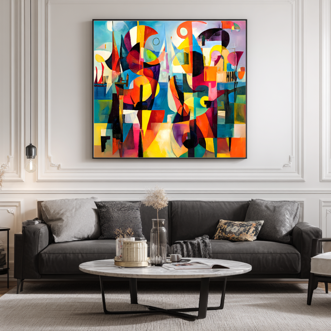
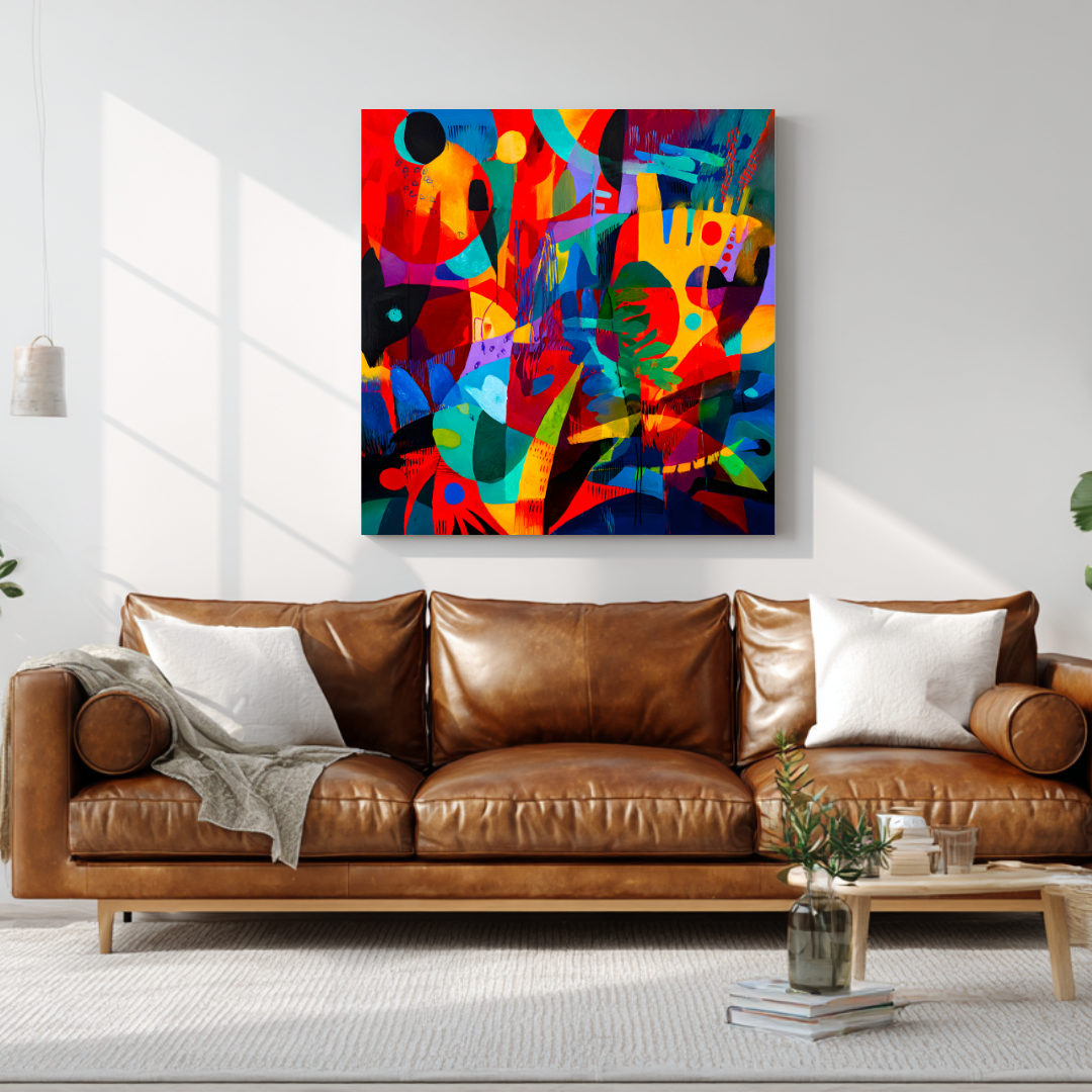
For a single square canvas — which is how Marta’s limited edition prints are produced, at 120×120 cm — the artwork works well above a standard-length sofa in a secondary room, or as one half of a pair for a larger primary wall. For a main living room in a 300+ m² villa, a pair of 120×120 cm works hung with deliberate spacing gives you an overall composition width of 260–280 cm, which has real presence.
Height matters too
The standard guidance is to hang the centre of the artwork at eye level — roughly 145–155 cm from the floor. Above a sofa or sideboard, allow 20–25 cm between the top of the furniture and the bottom edge of the canvas. Any less and the piece looks like it’s sitting on the furniture rather than commanding the wall above it.
For double-height spaces — entrance halls, stairwells, the open living volumes in many modern Andalusian villas — the usual rules loosen. These spaces often call for a single monumental piece or a vertical diptych that works with the architecture rather than against it.
One piece or several?
In most luxury interiors, a single substantial piece outperforms a gallery wall. A gallery arrangement can work — particularly in a corridor or a study — but as a primary focal point, a single well-chosen work feels more considered. It reads as a decision, not an accumulation.
The exception is when two related works are paired deliberately: same artist, same series, hung close together so they read as a single composition. That’s different from a gallery wall. That’s a considered diptych arrangement, and in the right space it has more weight than either piece alone.
Part Two: Colour in Mediterranean Light — What Changes South of Madrid
If you’re buying art for a home in southern Spain, you are buying it for a particular quality of light — and that changes the decision significantly.
The Mediterranean sun on the Costa del Sol is not the same thing as northern European daylight. It’s directional. It’s strong. At noon in July it’s almost overhead; by late afternoon it’s pouring in low and warm and orange through west-facing windows. Colours behave completely differently under these conditions than they do in a Scandinavian interior or a grey London light.
What holds up in strong southern light
Layered warm tones — ochre, terracotta, burnt sienna, warm white, deep sand — hold their presence from morning through evening. They don’t disappear in the brightness of midday or go flat at dusk. They shift, which is precisely what makes them interesting to live with.
Deep accents — indigo, forest green, charcoal, dark umber — provide contrast without competing with the architecture. A painting with a deep ground colour and warmer surface marks reads completely differently in strong light than it does in a dimly lit gallery. The light pulls out the surface; the depth holds.
Single-colour flat fields can be problematic. In bright noon light they can feel overexposed — washed out, weightless. By evening they can feel oppressive. What looks refined under showroom or gallery lighting can be difficult in the conditions these homes actually have.
What this means in practice
When choosing abstract work for a Mediterranean interior, look for paintings with genuine tonal range. Work where the eye can travel across the canvas and find different things at different light levels. A piece that shows you something different at 10 in the morning and at 6 in the evening is not a piece you’ll tire of. It’s a piece you’ll live with for decades.
This is one of the reasons Marta Ellie’s work tends to suit homes in this region well. After twenty years working as an art restorer on the paintings of the Spanish and northern European masters — studying how Velázquez and Rembrandt built their surfaces, layer by layer, glaze by glaze — her own painting reflects that layered approach. There’s always something underneath what you first see. Strong light doesn’t flatten it; it reveals more of it.
The Mediterranean palette she works with now — mineral blues, bleached neutrals, warm ochres, the specific orange that appears on the Costa del Sol coast at 5 pm in late September — comes from looking at this landscape for years. It’s not a decorative choice. It’s observation.
Part Three: Abstract Art, Specifically — What Makes It Work in an Interior
Abstract art is the most misunderstood category of wall art, and it’s misunderstood in both directions.
Some buyers avoid it because they’re not sure how to choose — without a subject, without a recognisable image, they feel like they’re choosing blind. Others buy it carelessly, treating it as neutral background, assuming that because it’s non-representational it won’t create friction with anything else in the room.
Both mistakes cost people money they’d rather not waste.
Abstract work has a mood
A strong abstract piece is not neutral. It has a mood, a temperature, a degree of visual energy. Choosing to live with it means choosing to live with that mood — on a Tuesday morning when you’re distracted, not only on the Saturday afternoon when it first went up.
This is why it matters to see a piece under conditions that resemble how you’ll actually experience it. Not on a laptop in a bright room. Not in a gallery with controlled lighting at a private view. Ask for images taken in daylight. Ask for images taken in evening light. Ask how the piece behaves differently at different times of day. A good artist — and a good print producer — can give you that information.
Style within abstraction
Abstract art is not a single thing. It spans gestural expressionism (large, loose, energetic marks), geometric abstraction (structured, architectural, often minimal), painterly fields (where the interest is in the surface texture and tonal variation rather than line), and combination approaches that don’t fit neatly into any category.
Marta’s work sits primarily in the expressionist and painterly field space, though her work in the Abstract Modern series includes pieces with more structural geometry. The difference matters for an interior:
- Gestural work adds energy and movement. It suits rooms with clean architecture — modern villas with white walls and polished concrete — where the painting can be the thing that breathes.
- Geometric and structured work adds order. It suits rooms that already have warmth from materials — wood, stone, textile — and benefit from a counterpoint of precision.
- Layered painterly work is the most adaptable. It reads differently from different distances and under different light. It tends to work across a wide range of interior styles.
What abstract art is not good for
Abstract work is not a good choice if what you actually want is a landscape of the Ronda mountains or a portrait of a person you love. It’s a good choice when you want something that contributes to the atmosphere of a room without being about anything in particular — something that adds feeling without adding narrative.
If you have a specific subject in mind, a commission is the route. More on that below.
Part Four: Limited Edition Prints — What They Are and Whether They’re Worth Buying
The word “print” covers an enormous range of things. At one end: mass-produced posters from large online décor retailers, printed on thin stock in unlimited numbers with no relationship to an original artwork. At the other: limited edition giclée prints produced directly from an artist’s original painting, on museum-quality archival materials, in numbered editions that close permanently.
These are not the same thing, and the gap between them — in material quality, longevity, investment behaviour, and what they do to a room — is significant.
What a giclée print actually is
Giclée is a fine-art printing process that uses archival pigment inks on high-quality substrates — canvas, cotton rag paper, or fine art papers. The name comes from the French for “to spray”; the process uses a precision inkjet system capable of reproducing the tonal range and colour accuracy of an original painting far beyond what conventional printing can achieve.
The materials matter. Marta’s limited edition prints are produced on 365 g/m² museum-quality canvas — a weight and density that gives the surface genuine body, the kind you can see and feel. They’re printed with pigment inks rated for 100+ year light stability under normal display conditions. This is not a poster that will fade in five years. This is a production intended to outlast the home it’s in.
What “limited edition” means
Each print in Marta’s collection is produced in an edition of 20 copies. When 20 are sold, the edition closes. No further copies are produced from that image. Each print is hand-signed and numbered — 3/20, 7/20, and so on — by Marta directly.
This matters for several reasons. It means the print has provenance — a direct, documented relationship between the artwork and the artist who made it. It means the edition will not be diluted by unlimited future production. And it means that as editions sell through, the remaining copies of a given work become rarer. Buyers who acquire early editions are not buying into a mass-produced product; they’re buying into a controlled release with genuine scarcity.
Price range and what you’re getting
Marta’s limited edition prints are priced between €300 and €500. At that price point, you are getting:
- A 120×120 cm artwork on archival canvas
- Museum-quality giclée print production
- A hand-signed, numbered certificate of authenticity
- An edition limited to 20 copies worldwide
- Worldwide shipping from Málaga, fully insured
- Direct provenance from the artist — no gallery, no intermediary
For context: an equivalent-quality print from a gallery or art fair would typically carry a 40–60% markup to cover the gallery’s margin. Buying directly from the artist means the price reflects the actual cost of production and the artist’s creative work, not a distribution chain.
What prints are not
A limited edition print is not an original painting. The surface is different — technically excellent, but not hand-applied pigment, not the physical record of the artist’s gesture on the canvas. For buyers who want exactly that — the original, the only one in existence — a commission is the right route.
And a limited edition print from a serious artist is not a poster. If someone offers you “fine art prints” at €30–€50 in an edition of 500 or more, with no direct artist relationship and no archival production standard, that is a poster. It may be a nice one. But it will not hold a room the way a genuine limited edition will, and it will not hold value.
Part Five: Commissioned Original Paintings — When and Why
There are spaces where the right answer is an original. Not because prints aren’t good enough — they are — but because some situations call for something that exists in the world as a single object, made for that room, that wall, that light condition, that brief.
When a commission makes sense
The room is a primary statement space. A double-height entrance hall. The main living room of a 500 m² villa in Sotogrande. A boardroom. The primary bedroom of a property that will be photographed for architectural media. These are spaces where the art is part of the architecture, not a finishing touch. An original painting — made at the right scale, to the right brief, by an artist whose work you know and trust — holds that space differently than anything else.
Scale is not standard. A 120×120 cm print is a strong piece. But some walls need a 200×150 cm canvas, or a 250×100 cm horizontal, or a format dictated by the architecture rather than a standard product range. Originals can be made to any format. Prints cannot.
You want the singularity. There’s something about owning the only copy of a thing that matters to certain collectors and certain spaces. If that matters to you — if you want to know that the piece on your wall exists nowhere else in the world — an original is the only answer.
You have a specific brief. Colour palette, mood, energy level, relationship to a specific material in the room (a particular stone, a textile, a flooring choice) — a commissioned painting can be developed in direct dialogue with those requirements. A print from an existing collection cannot.
How the commission process works
Working with Marta on a commission begins with an enquiry — via the commissions page or direct contact. The first conversation is about the space: dimensions, light conditions, how the room is used, what’s already in it, what the brief is trying to achieve.
From there, Marta produces a written proposal outlining her interpretation of the brief, the scale she recommends, the palette direction, and the timeline. For commissions above a certain scale or complexity, an initial study or colour reference may be produced before the full work begins.
The timeline for an original commission is typically eight to twelve weeks from confirmed brief to delivery. This varies depending on scale and current studio workload. Larger works — or works that go through multiple development stages — may take longer, and that’s discussed transparently upfront.
Pricing for commissioned originals starts at €3,000 for smaller-scale works and scales with size, complexity, and the nature of the brief. Large-format works for architectural spaces typically fall in the €5,000–€9,000+ range. All commissions include shipping, fully insured, direct from Marta’s studio in Málaga.
What buyers typically do
Many buyers who’ve worked with Marta do something practical and sensible: one original for the primary statement wall — the piece the room is built around — and curated limited edition prints for the rooms that surround it. This gives them the singularity where it matters most, and artist-quality work throughout, at a total investment that makes sense across the property.
Part Six: Buying Directly from the Artist — Why It’s Different
Most art changes hands through layers: galleries, dealers, auction platforms, online marketplaces. Each layer adds margin and removes certainty. By the time a buyer acquires a piece through conventional routes, they’ve often paid significantly more than the artist received — and know significantly less about the work’s origin, production, and condition than they would have if they’d gone directly to the studio.
Buying directly from a working artist is different in ways that matter.
You know exactly what you’re getting
With a direct purchase, provenance is simple and complete. You bought this piece from the artist who made it. There is no chain to trace, no question about what’s authentic, no possibility of a misrepresented edition or a print passed off as something more than it is. The documentation — signature, certificate, edition number — comes directly from the source.
Advice is actually useful
When you enquire about a piece through a gallery, the person helping you may have limited knowledge of the work’s specifics. They may not know how it behaves in different light conditions. They may not be able to advise on sizing with any real authority. They’re selling something on behalf of someone else.
When you contact Marta directly, you’re talking to the person who made the work. She can tell you how a piece has behaved in previous installations, which pieces suit which interior conditions, what scale would work best for your wall. That’s not a sales conversation. It’s an informed one.
No gallery markup
Gallery commission rates typically run at 40–60% of the sale price. That means for every €1,000 a buyer spends through a gallery, the artist receives €400–€600. The remainder covers the gallery’s costs and margin.
Buying direct means the price you pay is the artist’s price. It doesn’t mean undercutting the work — artists price their work to reflect its value, not to race to the bottom — but it does mean you’re paying for the work, not for the distribution infrastructure around it.
A relationship with the work
Something happens when you buy directly from an artist that doesn’t happen when you buy through an intermediary. You learn how the piece was made. You might see work-in-progress images. You understand where it came from — a particular studio in Málaga, a particular period of exploration, a particular reference to the light at a particular time of year. That knowledge becomes part of how you experience the piece, every time you look at it.
This is what collectors mean when they talk about provenance. Not just a paper trail, but a story that makes the work richer to live with.
Part Seven: About Marta Ellie — The Work and Where It Comes From
Understanding the background of the artist whose work you’re considering is part of making a good decision. It’s not incidental.
Marta Ellie was born in Kraków in 1985. She trained as a painter and spent twenty years as a professional art restorer — working on paintings, sculptures, and religious works in churches and private collections across Poland. She also taught art at an international school. These aren’t decorative credentials. They represent an unusually technical education in how paintings are actually built: what materials last, what materials fail, how the great painters of the European tradition constructed their images from the ground up.
An art restorer works on the inside of paintings in a way that a gallery visitor never does. You see where the artist changed their mind, where a composition was reworked, how the ground affects the surface, why a particular glaze holds light differently than the paint layer beneath it. Twenty years of that kind of close looking gives you a literacy in painting that no formal education can replicate.
When Marta moved to southern Spain — and the Mediterranean light hit her work for the first time — something shifted. The colour world she’d been working with, built under the grey and amber light of Polish winters and long summers, no longer fit. She started over. Not the technique; that stayed. But the palette, the orientation, the relationship between surface and depth.
The result is work that sits between what she learned and where she is now. The layered, considered construction of the European restoration tradition, applied to the light and colour and landscape of Andalusia. Warm ochres and mineral blues. Deep charcoal grounds with terracotta surface marks. The specific bleached-out quality of noon light on white stucco. The orange of five o’clock on the water.
Her Abstract Modern series explores geometric tension within expressive painting — structured compositions that have warmth and movement despite their architecture. The Coastal & Mediterranean series is looser, more gestural, built more directly from observation. Both series are made in the same studio in Málaga, from the same twenty-year foundation, for the same purpose: something worth looking at for a long time.
Part Eight: Four Mistakes Buyers Make (and How to Avoid Them)
1. Choosing style before scale
The right style at the wrong size is still wrong. Scale is the first decision, not the last. Do the measurement before you look at a single image.
2. Buying from a cropped product thumbnail
A piece that fills a laptop screen comfortably may cover a fraction of your actual wall. Always check dimensions in centimetres before ordering. If a retailer doesn’t display physical dimensions prominently, that’s telling you something about how they expect their customers to make decisions.
3. Treating abstract work as neutral
Strong abstract pieces have a mood, a temperature, a degree of energy. You are choosing something to live with daily. Buy for how it will feel at 7:30 on a weekday morning when you’re distracted, not only for how it looked in the staging photograph.
4. Ignoring wall colour and light direction
Abstract work has a dialogue with its background. The same painting in front of a terracotta-washed wall and in front of a pale plaster wall are completely different experiences. If you’re unsure how a piece will work with your wall colour, ask. A good artist, selling directly, can give you an honest answer.
Part Nine: Frequently Asked Questions
What size abstract wall art works above a sofa?
Aim for 60–75% of sofa width. For a 240 cm sofa, that’s roughly 145–180 cm of total artwork width — achievable as a single large piece or two related works hung together. A single 120×120 cm print works well above a shorter sofa (up to about 180 cm) or in secondary rooms where the wall doesn’t need to carry the weight of a primary focal point.
Is one large abstract better than a gallery wall?
In most luxury interiors, yes. A single substantial piece creates a cleaner focal point and usually reads as more considered than a collection of smaller works. Gallery walls work well in corridors, reading rooms, or studios — spaces where accumulation feels right rather than competitive with the architecture.
Are abstract canvas prints worth buying?
Yes — if they’re archival giclée prints from a genuine limited artist edition, produced on museum-quality materials, in a controlled number. Not if they’re mass-produced décor prints sold in unlimited quantities with no direct relationship to an original artwork. Material quality, production standard, and edition control determine whether a print holds value, holds a room, and holds up over time.
What’s the difference between a giclée print and a poster?
Production process, materials, and edition control. A giclée print uses archival pigment inks and museum-quality substrates, produced to the artist’s specification in a numbered limited edition. A poster is typically a CMYK offset or inkjet print on paper or thin stock, in unlimited quantities. The visual difference at a distance may be small. The difference in longevity, provenance, and how it reads in a serious interior is significant.
Should I buy art directly from the artist?
For most buyers who care about quality, provenance, and getting genuine advice about what will work in their space — yes. You pay less than through a gallery (no middleman margin), you know exactly what you’re getting, and you can have a real conversation about whether a piece is right for your situation.
How long does a commission take?
Typically eight to twelve weeks from confirmed brief to delivery, depending on scale and studio workload. Larger or more complex works may take longer. Timeline is discussed and agreed upfront at the start of every project.
Do you ship internationally?
Yes. Limited edition prints are shipped worldwide from Marta’s studio in Málaga, fully insured. Commissioned originals are also shipped internationally, with specialist art transport arranged for large-format works.
What if I’m not sure which piece is right for my space?
The best step is to get in touch before buying. Share your wall dimensions, a photo of the space if you have one, and a sense of what you’re looking for. Marta is involved in every direct sale and can give you specific, honest guidance — not a sales pitch.
How to Take the Next Step
If you’re ready to browse existing work: the prints collection shows all available limited edition giclée works, with dimensions, edition status, and pricing. Some editions are already sold through. If a piece you want is listed as closed, it’s gone — that’s what a genuine edition of 20 means.
If you have a specific space in mind and want to discuss scale, palette, or whether an original commission is the right route: use the commissions enquiry page. The first conversation costs nothing and carries no obligation. It’s just a conversation about whether there’s a good fit between what you need and what Marta makes.
And if you’re still figuring out what you actually want — whether abstract is right for the room, whether a print or an original makes more sense, what scale would work — there are more guides on the blog:
- Large canvas art for living rooms — detailed guidance on sizing for specific room types
- Original paintings vs art prints — honest comparison for buyers trying to decide
- How to commission a painting — what the process looks like from enquiry to delivery
- Buying art directly from artists — why direct matters and what to ask
All prints are shipped worldwide from Europe. Commissions enquiries are responded to within 48 hours.
From the collection
Prints related to this guide
Limited editions of 20 · Giclée on 365 g/m² canvas · Signed by Marta Ellie
View All Prints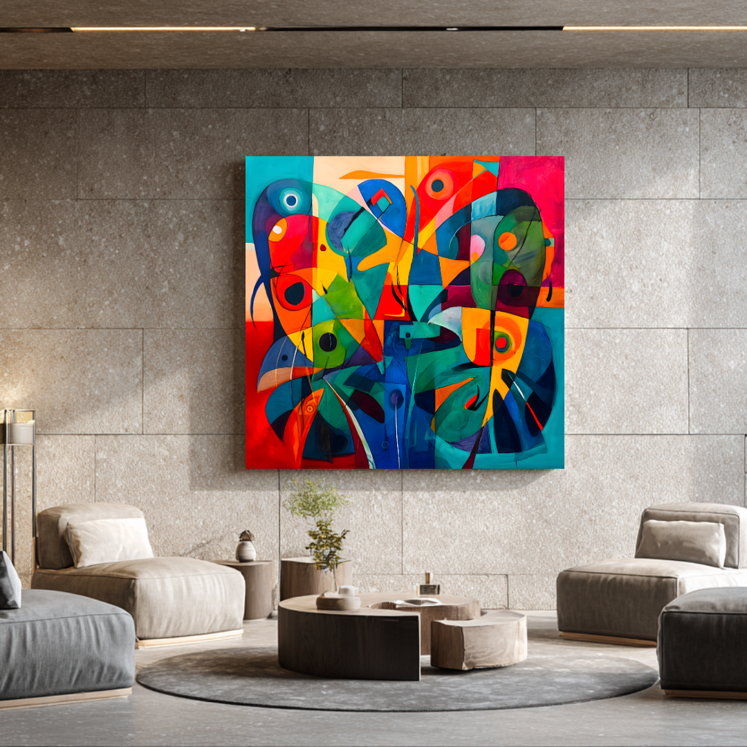
Read next
Ready to find yours?
Museum-quality prints, from €300.
Limited editions of 20. Giclée on 365 g/m² canvas. Shipped worldwide from the studio in Málaga.
More articles