Buying Guide
How to Make Your Home Look Expensive with Art
18 April 2025
There’s a quality that certain homes have — a sense of considered luxury that has nothing to do with how much the furniture cost. You notice it immediately when you walk in. The room feels settled. Intentional. Like someone with genuine taste lives here.
Art is usually doing a significant amount of that work.
Not expensive art, necessarily. Not a gallery-white room full of untouchable originals. Just the right art, chosen carefully, placed well. This guide explains exactly how it’s done — the principles that interior designers use and rarely explain clearly, applied practically to real homes.
Why Art Signals Wealth More Than Almost Anything Else
Most home décor — furniture, textiles, lighting — is available at every price point, and the differences between cheap and expensive versions are not always obvious to the eye. A £3,000 sofa and a £600 sofa can look remarkably similar in a photograph.
Art doesn’t work this way. The difference between a mass-produced print from a large retailer and an original painting — or even a high-quality artist-made print — is immediately visible to almost anyone. The surface quality is different. The colour depth is different. The sense that a human being made this specific thing, with intention, is either present or it isn’t.
This means that art punches above its weight in terms of perceived value. A well-chosen canvas print from a professional artist, hung in the right position with the right amount of space around it, does more for a room’s sense of luxury than most purchases twice or three times the price.
The Most Important Rule: Treat Empty Space as an Asset
The single biggest mistake that makes a home look less expensive than it is — not more — is filling every surface and wall with things.
Expensive homes breathe. The walls have fewer things on them, not more. The things that are there are chosen carefully and given room to exist. The negative space around a piece of art is not wasted wall. It’s what makes the art feel significant.
The practical implication: if you currently have a lot of small pieces scattered across your walls, consider editing down to fewer, larger works. One strong canvas where three small prints were hanging will almost always look more expensive, not less.
Invest in One Great Piece Per Room
You don’t need art in every room to make your home feel considered. You need one genuinely good piece per key space — and you need it to be right.
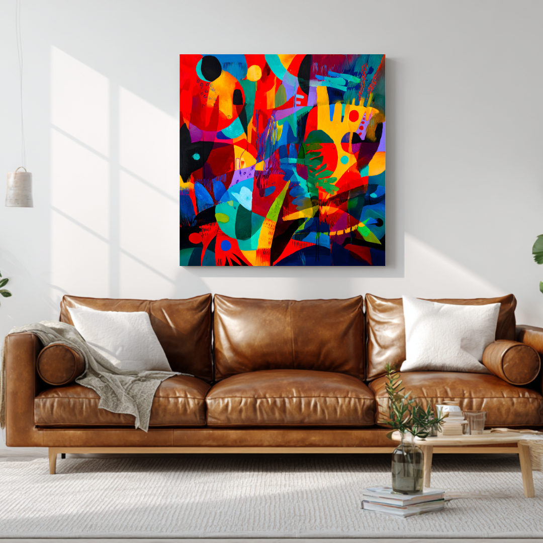
A single original painting or high-quality artist print on the main wall of a living room does more than a roomful of mediocre art. It becomes the visual anchor of the space. Everything else — the sofa, the rug, the cushions — organises itself in relation to it.
This is how interior designers approach art in luxury projects. They don’t scatter. They anchor. One significant work per room, chosen for that room, positioned deliberately.
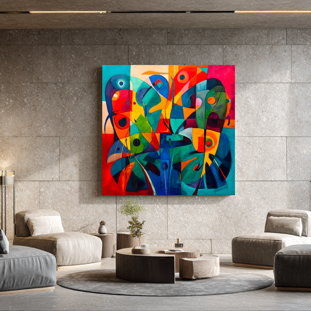
 Spirals — abstract modern series, shown as a room anchor
The corollary: it’s worth spending more on fewer pieces. A €300 canvas print that’s genuinely beautiful, well-made, and right for the space is a far better investment than six €50 prints that individually look fine and collectively look like nothing in particular.
For guidance on choosing the right abstract or statement piece for a key wall, see abstract wall art: how to choose pieces that transform a room.
Size Up: The Shortcut That Works Every Time
If there’s one change that makes a room look more expensive almost instantly, it’s replacing undersized art with correctly sized art.
Small art on large walls is the most reliable signal that a room hasn’t been professionally considered. It looks like an afterthought — like the art was chosen first and the wall discovered later.
The rooms that feel most luxurious typically have art that is almost uncomfortably large by conventional standards. A canvas that fills most of a wall above a sofa. A painting in an entrance hall that you look up slightly to take in fully. Scale creates authority — and authority reads as expense.
A useful test: if you’re deciding between two sizes and one feels slightly too bold, choose that one.
Frame It Right — or Don’t Frame It at All
Framing choices have an enormous effect on perceived quality, and most people default to whatever frame the print came with or whatever was cheapest at the framing shop.
Simple frames read as more expensive than ornate ones in contemporary homes. A thin black metal frame or a narrow natural wood frame signals confidence. Elaborate gilt frames signal decoration.
Unframed stretched canvas has its own authority. A well-made canvas print or original painting on a deep-sided stretcher, hung without a frame, has a directness that suits modern interiors well. The art itself is the object — there’s no frame saying “this is a picture.” It simply is.
Consistency across a room creates coherence. If you have multiple pieces in one space, framing them consistently — same frame, or all unframed — ties them together and makes the collection look intentional.
Mat boards add perceived value. A print with a generous white or off-white mat inside the frame looks significantly more considered than one without. Museums and galleries have known this for decades.
Placement: The Details That Separate Good from Great
Hang at the right height. The centre of an artwork should sit at approximately eye level — around 145–150 cm from the floor. The most common mistake is hanging too high, which makes art feel like a shelf decoration rather than something you’re meant to engage with.
Relate the art to the furniture below it. Art hung above a sofa, a console table, or a bed should feel in conversation with that piece of furniture. Leave roughly 15–20 cm between the top of the furniture and the bottom of the frame. Too much space and the art detaches. Too little and it feels crowded.
Let art be the only thing on some walls. The most confident rooms give certain walls entirely to a single work of art, with nothing competing for attention.
Colour: Use Art to Introduce What the Room Is Missing
One of the most effective ways to use art to elevate a space is to treat it as a controlled introduction of colour — specifically the colour the room currently lacks.
A living room built entirely on warm neutrals — cream, beige, camel, wood — gains immediate sophistication from art that introduces a cooler, more complex note. Deep teal, dusty blue-green, or muted sage can do this work without disrupting the warmth of the room.
Conversely, a room that’s very cool and grey benefits enormously from art with warmth — amber, terracotta, dusty rose. The contrast between the room and the art is what creates the sense of considered design.
What doesn’t achieve this is art that exactly matches the room. Matching feels safe and reads as safe. Considered contrast feels confident and reads as expensive.
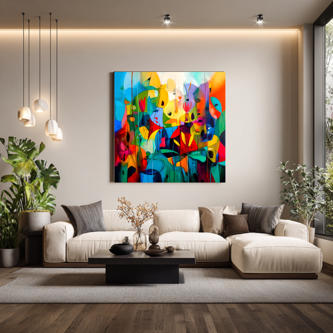
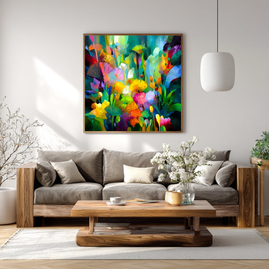
 Metamorphosis — a piece that introduces colour and depth to a neutral room
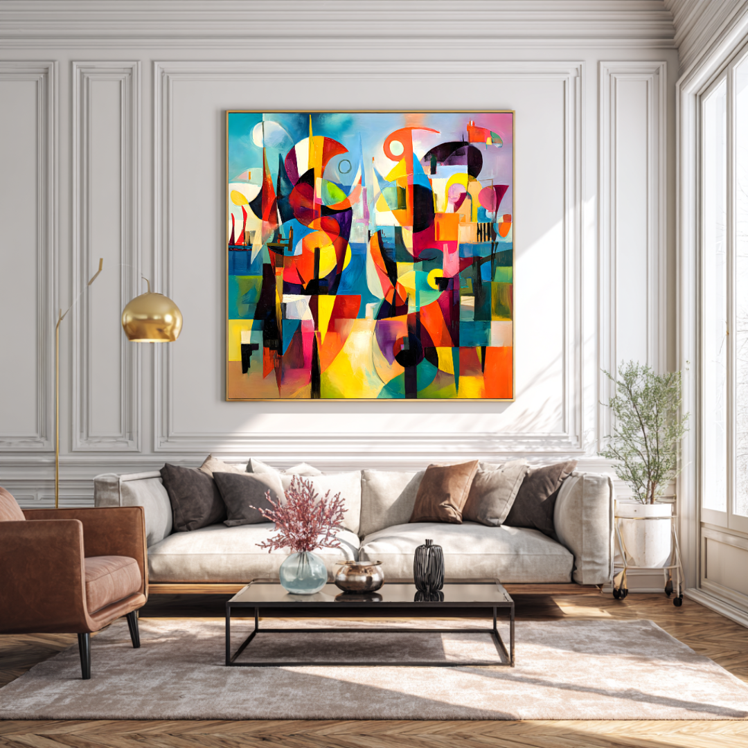
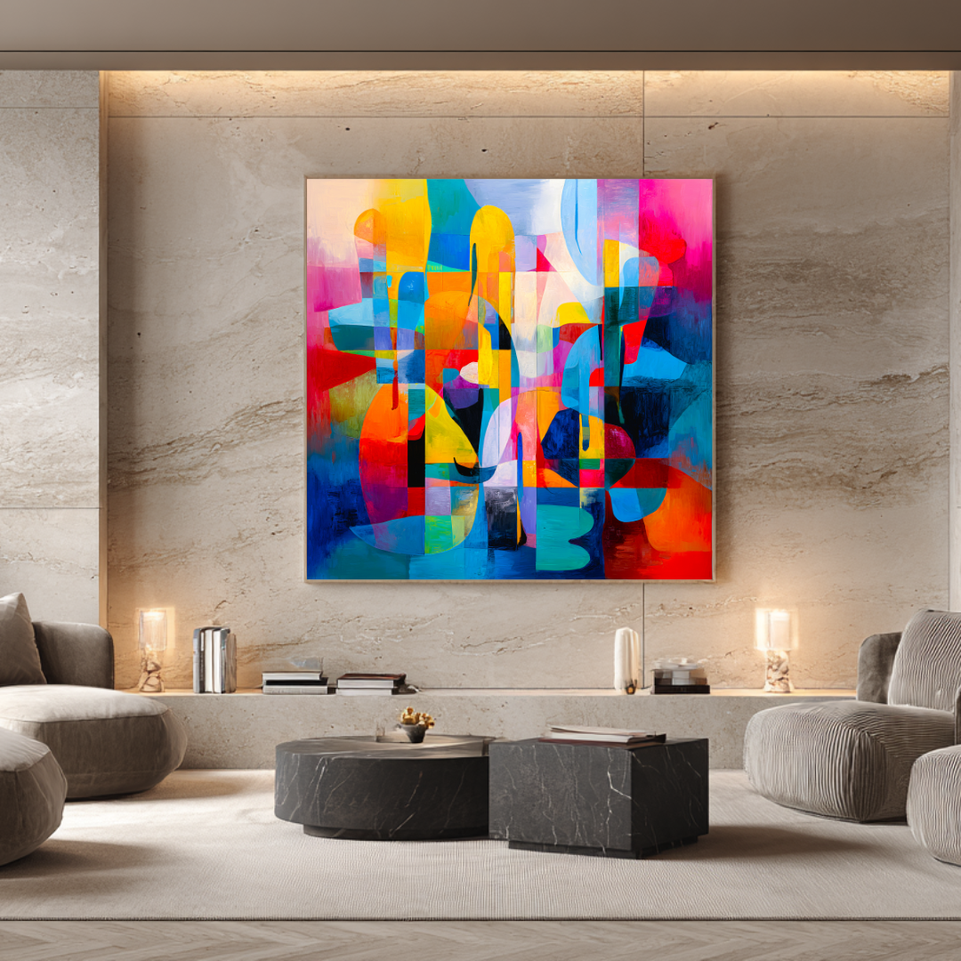
 Sanctuary — shown in context as a room anchor
Frequently Asked Questions
What type of art makes a room look more expensive?
Original paintings and high-quality artist-made prints consistently make spaces feel more considered than mass-produced reproductions. Beyond format, works with genuine surface quality — visible texture, depth of colour, layered paint — register as valuable in a way that flat graphic prints don’t.
Does expensive art actually look better in a home?
Not automatically — but carefully chosen art at the right quality level does. The difference that matters is not the price tag but the quality of the work itself. A well-chosen signed print from a professional artist at €150 can outperform a carelessly bought original at €800.
How do I make a small room look more expensive with art?
Counterintuitively, one larger piece tends to work better than several small ones in a small room. It makes the space feel like a deliberate interior decision rather than accumulated clutter. Keep the palette calm and the frame simple.
Is it better to buy original art or prints to elevate a room?
For the main focal wall in a key room, an original painting creates the strongest effect. For secondary walls, guest rooms, or where budget is a real consideration, signed limited edition artist prints are the intelligent alternative — they carry the visual quality of original work at a more accessible price point.
Marta Ellie’s canvas print collection is produced directly from original paintings — each one a real work of art by a professional painter with over 20 years of experience. Signed and available in multiple sizes.
Ready to invest in something made specifically for your space? Commission an original painting designed around your home, your colours, and your walls.
From the collection
Prints related to this guide
Limited editions of 20 · Giclée on 365 g/m² canvas · Signed by Marta Ellie
Abstract & Modern
Metamorphosis
€325
Abstract & Modern
Dreams
€300
Coastal & Mediterranean
Harbor of Dreams
€350
Read next
Ready to find yours?
Museum-quality prints, from €300.
Limited editions of 20. Giclée on 365 g/m² canvas. Shipped worldwide from the studio in Málaga.
More articles